Assignment 5
Goals
Interaction and Linked Views in D3
Instructions
There are three parts to the assignment. You may complete the assignment in a single HTML file or use multiple files (e.g. one for CSS, one for HTML, and one for JavaScript). You must use D3 v5 for this assignment. All visualization should be done using D3 calls. You may use other libraries (e.g. lodash.js or jQuery), but you must credit them in the HTML file you turn in. Extensive documentation for D3 is available, and Vadim Ogievetsky’s example-based introduction that we went through in class is also a useful reference. In addition, Scott Murray’s Interactive Data Visualization for the Web is a good reference.
Due Date
The assignment is due at 11:59pm on Friday, November 22.
Submission
You should submit any files required for this assignment on Blackboard. You may complete the assignment in a single HTML file or use multiple files (e.g. one for HTML, one for CSS, and one for JavaScript). Note that the files should be linked to the main HTML document accordingly. The filename of the main HTML document should be a5.html. Blackboard may complain about the files; if so, please zip the files and submit the zip file instead.
Details
In this assignment, we will again examine Illinois farming data. Note, however, that some new sales data has been added, and there is a new URL. This data comes from the USDA’s Census of Agriculture through the QuickStats service. Specifically, we are interested in how much of each county has been used for farming over the past couple decades. This data has been extracted and is available online. To create maps, we will use Illinois county boundariess as specified by the Illinois State Geological Survey. This shapefile has been converted to the GeoJSON format that D3 can more easily handle. In addition, the boundaries have been simplified. The goal of the assignment is to extend our work in Assignment 4 to examine farm sales and area with filtering and aggregation.
Data
Data Links
- IL County Boundaries GeoJSON: https://gist.githubusercontent.com/dakoop/2d6f78f5bbe75c0cea60cd7dfec3bb39/raw/dbb35c139c5147e14b2971835948d0af8362ed68/il-counties.geojson
- IL Farming Data: https://gist.githubusercontent.com/dakoop/2d6f78f5bbe75c0cea60cd7dfec3bb39/raw/d906d7830d723a0af89222274688bb160098c1d0/il-farm-acres-and-sales.json
- Full Gist: https://gist.github.com/dakoop/2d6f78f5bbe75c0cea60cd7dfec3bb39
0. Info
Like Assignment 1, start by creating an HTML web page with the title “Assignment 4”. It should contain the following text:
- Your name
- Your student id
- The course title (“Data Visualization (CSCI 490/680)”), and
- The assignment title (“Assignment 5”)
- The text “This assignment is all my own work. I did not copy the code from any other source.” (Your inclusion of this text indicates that you understand the consequences of violating the NIU Academic Integrity Standards.)
If you used any additional JavaScript libraries, please append a note to this section indicating their usage to the text above (e.g. “I used the jQuery library to write callback functions.”) Include links to the projects used. You do not need to adhere to any particular style for this text, but I would suggest using headings to separate the sections of the assignment.
A template for the assignment is provided: html, js; save them both as source. It will be very difficult to do the assignment unless you start from this template.
1. Filtering (30 pts)
We are curious about the farm crop sales in each county, and any spatial patterns. To do this, we can create a choropleth map that shows the sales per acre in 2017. The code to do this is provided in the template (html, js). However, there are two things you should notice about this visualization: (a) there are counties with negative sales, and (b) the counties near Chicago seem to generate larger sales per acre but likely have a smaller percentage of farmland. First, do filtering to remove those values that are unknown; these are indicated by a value of -999. It is ok to remove them completely from the in-memory, loaded dataset since we can’t use them for the other parts, either. Second, create a slider that allows us to filter our choropleth by the percentage of farmland. Specifically, only those counties whose percentage of farmland is in the selected range should be shown; the others should be gray.
Because we want the farmland filter to use a range, we need to be able to select the minimum and maximum of that range. This type of filtering is best done using a two-handle range filter which unfortunately is not currently a feature of HTML5. However, third-party libraries like noUiSlider support such behavior. The filter should support values from 0 to 100 percent. You need to implement the slider so that the it responds to the changes by highlighting counties that fall within the range, and graying out any counties that do not. Highlighted counties should also have a higher stroke weight.
Hints
- The template provides a finished choropleth map.
- Investigate
d3.keys,d3.entries, or thefor...instatement to iterate through thefarmDataobject - Use classes and CSS rules to simplify the highlighted and unhighlighted updates. In addition, D3’s
classedmethod may be used. - D3’s
filtermethod may be useful. - Any data bound to the visual elements is accessible later. Thus, given a selection,
s, with bound data, you can use that data to update the visual element:s.attr('fill', d => d.color2). - Reset every county to non-matching before setting those that match
- To override fill or stroke settings set via D3 using CSS, use the
!importantmodifier
2. Brushing (40 pts)
We are also interested in the relationship of the amount of farmland to the sales amount. We expect correlation, but we are also interested in those counties that have proportionally higher amounts of sales than most others. Perhaps those counties with smaller amount of farmland have higher sales because there is less competition. To investigate this, we will use a multiple-view visualization with two views, a choropleth map and a scatterplot. The choropleth shows the percentage of land used for farming in 2017, and the scatterplot shows the number of acres of farmland versus the crop sales amount for 2017. We will use two types of brushing (linked highlighting): (a) one-to-one highlighting between the scatterplot and the map, and (b) a way to highlight multiple counties using a dividing line on the scatterplot.
a. One-to-One Highlighting (25 pts)
Start from the template (html, js) which has the multiple-view visualization without any linked highlighting. Use the #linked-basic div for this part of the assignment. As the user moves the mouse over a county in the map, the corresponding point in the scatterplot should be highlighted. In addition, as the user moves the mouse over a point in the scatterplot, the corresponding county in the map should be highlighted.
D3’s .on(<event>, <callback>) functions will help handle mouseover and mouseout events over particular counties or points. Note that you can add these after the visualization has been created by selecting the corresponding elements. For example, map.selectAll('.county') selects counties and scatter.selectAll('.dot') selects scatterplot points which you can add on functions. You should have some way to highlight the selected item in both the map and the scatterplot. You need to link the name of the county in the scatterplot with the name of the county in the map. Remember that for a data item d corresponding to a county, d.properties.COUNTY_NAM is the name of the county. In the scatterplot, the data item d is encoded as an entry which means it’s name can be accessed as d.key. Remember to reset the selection when a user moves off the county or point.
Hints
- Be careful about doing
d3.selectAll. Make sure to constrain your select to the appropriate part of the DOM. D3 sub-selects work well for this. - Remember to remove highlights from counties/points other than the selected one.
- Use classes and CSS rules to simplify the highlighted and unhighlighted updates. In addition, D3’s
classedmethod may be used. - In an
onmethod, the current visual element is available viad3.select(this) - D3’s
filtermethod may be useful.
b. Region Highlighting (15 pts)
Again, start from the template (html, js), but use the #linked-advanced div this time. The scatterplot and map are drawn just like in Part a (using the createLinkedInit function), but more is added. Specifically, there is a user-selectable line that controls a shaded region which indicates which points should be selected. You can move this line by selecting it and dragging it, and you can rotate it by holding the shift key and dragging it. Doing so changes the shaded region. Your task is to select all the points that fall in the shaded region. A function inRegion is provided to tell you (true or false) whether a point with the specified area and sales values falls in the shaded region. Highlight those counties in the map. As the user moves or rotates the line, the visualization should update which counties are highlighted. Remember that
Hints
- Use classes and CSS rules to simplify the highlighted and unhighlighted updates. In addition, D3’s
classedmethod may be used. - If you removed data from
farmData(from the filtering in Part 1), you will need to check if the county is in the farmData before trying to access its area or sales properties. - Remember that you need to pass the number of acres and the sales amount to the
inRegioncall. - You will have to access the data in the same way as in part a
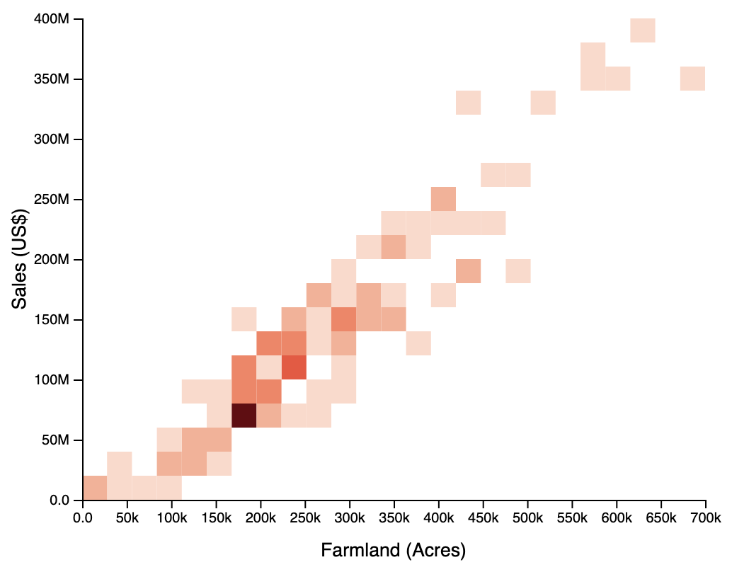
3. [CS 680 Only] Binned Scatterplot (30 pts)
Create a binned scatterplot (2D histogram) using the same data as the scatterplot in Part 2. For convenience, the template (html, js) provides the un-binned scatterplot code (createBinnedScatterplot) so you only need to change/update it to create the binned version. You should have 25 bins horizontally and 20 bins vertically, for a total of 500 bins, but note that many bins will be empty. The bins should be colored to indicate the number of points in each bin. Add a legend that shows the mapping from color to number of bins. There are two major steps: (1) determining the number of points in each bin, and (2) drawing the rectangles for the bins. You should be able to do these independently, except that you will need the number of points to color the bins properly.
Hints
- You should not need to update the axes or scales
d3.entriesis likely useful for iterating through the data (farmData)Math.floormay be useful in determining which bin a point falls in- To keep track of the counts of points in each bin, an associate array like Map or
d3.mapwill probably help
Extra Credit
- CS 490 students may do Part 3 for extra credit
- Allow users to select multiple counties in Part 2a and highlight all of them in the scatterplot
- Update the visualizations to use the average values for all the years from 1997 to 2017 instead of only 2017. For example, instead of
farmArea2017, you would use average offarmArea1997, …,farmArea2017 - Create a hex-binned scatterplot for Part 3