Assignment 3
Goals
Use different visualization tools, including Tableau, Observable Plot, and Data-Driven Documents (D3), to create a stacked bar chart.
Instructions
You will need to complete this assignment in multiple parts. All the results can be inserted into a single Observable Notebook, but you may submit a web page containing the results as well. You must use Tableau Public (or the Desktop version), Observable Plot, and D3 for this assignment. All D3 visualization should be done using the 7.x version. You may use other libraries (e.g. lodash) as long as they are not used to construct or modify SVGs, but you must credit them in the HTML file you turn in. Tableau offers video tutorials, and Observable Plot has documentation and examples For D3, there is extensive documentation available as well as examples, and Vadim Ogievetsky’s example-based introduction and the bar chart examples that we went through in class are also useful references.
Due Date
The assignment is due at 11:59pm on Monday, March 2.
Submission
You should submit any files required for this assignment on Blackboard. For Observable, do
not publish your notebook; instead, (1) share it with me
(@dakoop, view only) and (2) use the “Export -> Download
Code” option and turn in that file renamed to a3.tar.gz (or
a3.tgz) file to Blackboard. Please do both of these steps
as (1) is easier for me to grade, but (2) makes it possible to persist
the state of the submission. If you complete the assignment outside of
Observable, you may complete the assignment in a single HTML file or use
multiple files (e.g. one for HTML and one for CSS). Note that the files
should be linked to the main HTML document accordingly in a
relative manner (style.css
not
C:\My Documents\Jane\NIU\CSCI627\assignment3\styles.css).
If you submit multiple files, you may need to zip them in order for
Blackboard to accept the submission. The filename of the main HTML
document should be a3.html.
Details
In this assignment, we will be working with data from the City of
Chicago’s Traffic
Crashes Data. This dataset details traffic crashes in the city over
the past few years. Rather than using this dataset directly, I have
extracted data from 2024 and 2025 as a subset that is available as a csv
file. Each record has a CRASH_DATE property storing the
full date and time of the crash along with its
FIRST_CRASH_TYPE which indicates the type of crash. We are
interested in analyzing the number of types of crashes per month. The
data is available here:
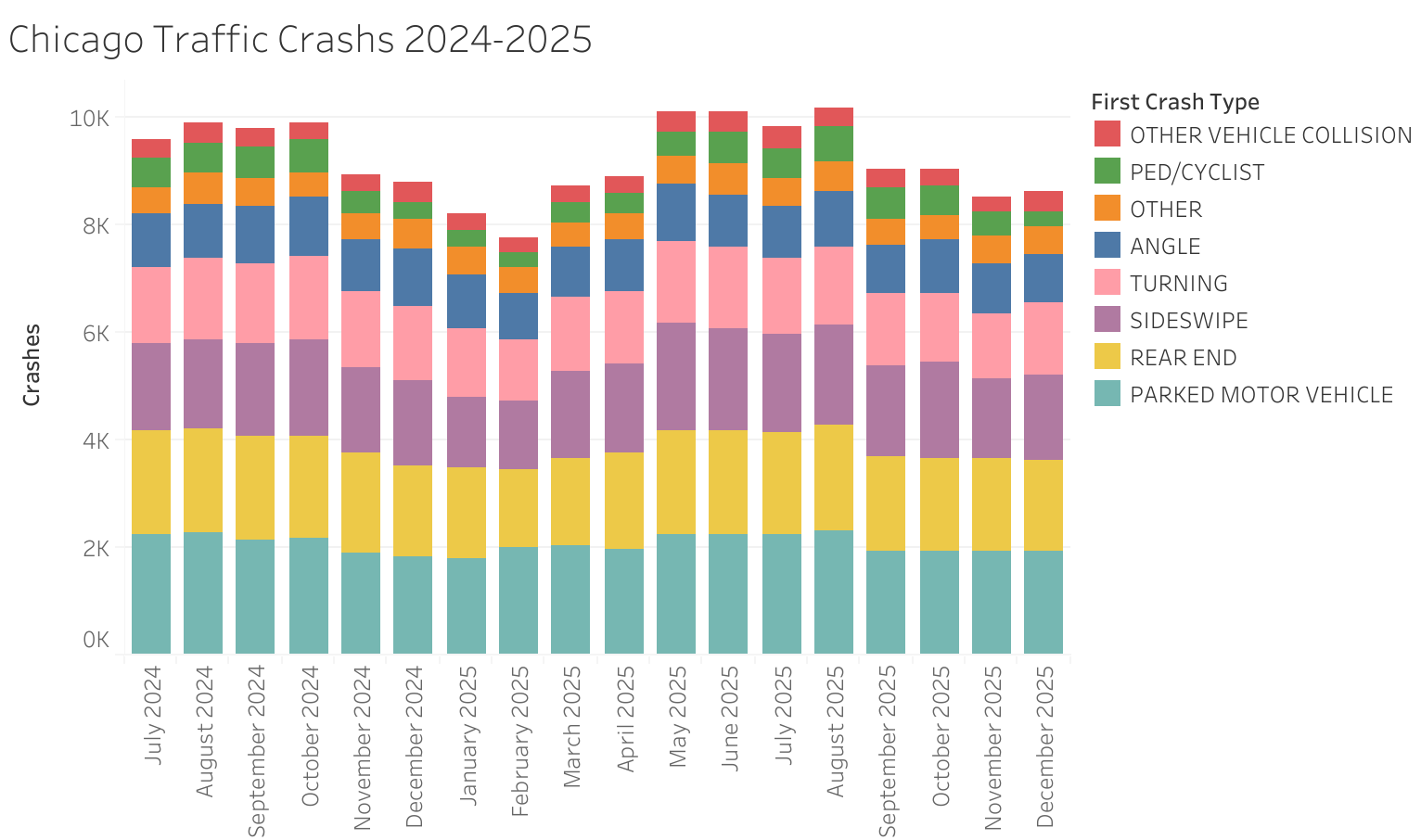
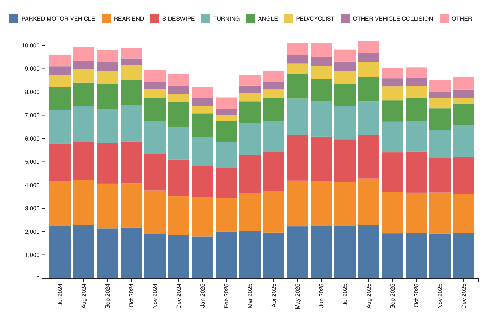
We will be using Tableau (Public), Observable Plot, and D3 to create a vertically stacked bar chart. The visualizations should show each month along the x-axis and a bar with the total number of crashes each month. That bar should be split into subunits for each type of crash, where each crash type receives its own color. Order the bar fragments appropriately. Provide a legend describing which colors map to which result.
As with Assignment 1, make sure the beginning of your main web page (or notebook) contains the following text:
- Your name
- Your student id
- The course title (“Data Visualization (CS 627/490)”), and
- The assignment title (“Assignment 3”)
If you used any additional JavaScript libraries, please append a note indicating their usage to the text above (e.g. “I used the jQuery library to write callback functions.”) Include links to the libraries used. You do not need to adhere to any particular style for this text, but I would suggest using headings to separate the sections of the assignment.
1. Tableau (25 points)
Either use Tableau
Public or download Tableau
Desktop and register here
to receive a free academic license (You may work before
your license arrives using a 14-day trial). Load the CSV file and create
a stacked bar chart. If you are using Tableau Public, make sure the
publish your visualization (required to save it), and put a link and
image in your notebook/web page. To download an image, click the
download button( ) on the current sheet.
You can include the image in a notebook by uploading it as a
FileAttachment to Observable, or you can add it to a web page using the
standard
) on the current sheet.
You can include the image in a notebook by uploading it as a
FileAttachment to Observable, or you can add it to a web page using the
standard img tag. If you are using Tableau Desktop and wish
to turn in the workbook (.twb file), you may also do that, but put an
image in your notebook/web page and a note about the twb file.
Hints
- There is documentation on creating a stacked bar chart available.
- You can convert the
CRASH_DATEcolumn to the datetime format. - Think about whether a dimension or measure is most appropriate and what aggregations are appropriate.
- Think about which colors to use. We will discuss this design choice more later in the course.
- You can reorder the bars. Decide on a reasonable order.
2. Observable Plot (30 points)
Observable notebooks automatically import the d3 and Plot libraries
so you can use them directly. However, if you are using another tool for
this assignment, make sure to include these two libraries. See the documentation
about how to include them, specifically about how to use them in vanilla
HTML or as a UMD bundle. To load the data, use d3.csv
which can load the data from the URL above. Note that converting the
data types after reading the csv or using D3’s autoType
functionality when loading will help avoid parseInt calls
later on. Note, however, that parsing the date will likely require a
call to d3.isoParse.
You do not need to match the colors in the example solution, but you
should make sure that your colors are in the same order for each month.
Check the margins and make sure you have a legend.
You may choose to either bin the data using Plot’s bin
transform, or use the code from Part 3 to aggregate the data by
year-month, and then use Plot.
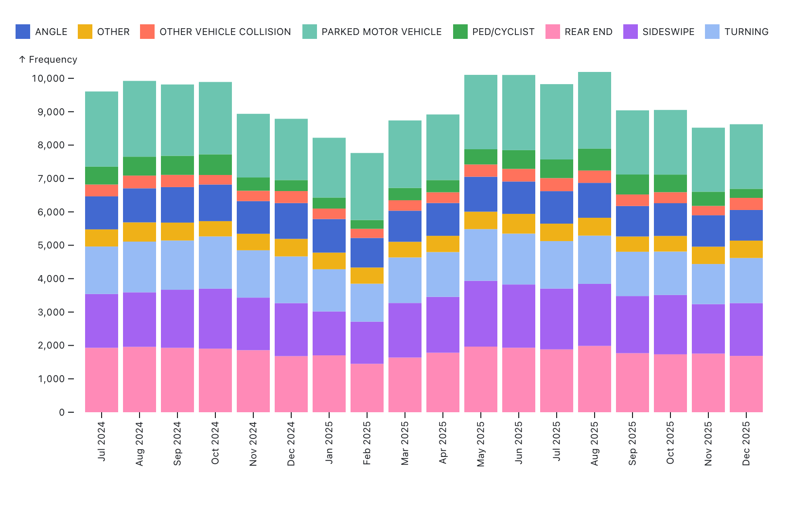
Hints
- Investigate the
sortoption to order the individual bars in a stack. - Examine the options for the x-axis, including formatting and rotating the tick labels
- Look at the layout options for margins
- There are also many options for the legend
3. D3 (30/45 points)
In this part of the assignment, use D3 to create the same (stacked)
bar chart. CS 490 students need only create a bar chart showing the
totals per month with appropriate axes and labels, but CS 627 students
should create the stacked version with a legend. For both parts, we will
need the data to be organized differently (by month). You can use the
following code which assumes your original data is stored in
crashes:
crashesMonthType = d3.rollup(crashes, v => v.length, d => (d.CRASH_DATE.getFullYear() + '-' + (d.CRASH_DATE.getMonth() + 1).toString().padStart(2,0)), d => d.FIRST_CRASH_TYPE);
crashesByMonth = [...crashesMonthType.entries()].map(d => ({...Object.fromEntries([...d[1].entries()]), "Total": d3.sum(d[1].values()), "Date": d[0]}))
This groups the crashes by a string YYYY-mm, adds the
total number of crashes (Total), and includes entries for
each crash type where the key is the crash type, and the value is the
number of crashes of that type. CS 490 students can then access the
values from the Total attribute.
For CS 627 students, it may be easier to first create a non-stacked
bar chart (use the provided method above), and then try the stacked
version. The axes and labels should be similar to Part 2. The stacked
version should have a legend that indicates the relationship between the
bar components and the colors. This legend can be created using the
Swatches code in this notebook. In
Observable, you can do
import {Swatches} from "@d3/color-legend"in one cell and then pass your color scale (color) to
Swatches, appending to another d3 selection divElt as
follows:
const swatches = Swatches(color);
divElt.append(() => swatches)
Note that you’ll want to create a div that holds the SVG and the swatches if you take this approach.
Hints
d3.scaleBandis useful for bar charts.- D3 has routines (e.g.
d3.axisLeft) to build an axis given a scale - A group element with a transform can help shift the entire visualization so that labels or axes have space (margin convention)
- To obtain the maximum monthly total, you can use
d3.maxwith a proper accessor d3.stackmay be useful here. Check how thekeysfunction works with the stack.- If you use
d3.stack, you will need nested selections (note that these groups may be different than you expect)
Extra Credit
- CS 490 students may complete the stacked version in D3 for extra credit
- (15 pts) Create a stacked bar chart of the data using Vega-Lite. You can include this in an Observable Notebook or a webpage using the Vega-Lite API.
- (15 pts) Create a stacked bar chart of the data using matplotlib. Turn in the python code and the generated image as a separate file.