Assignment 2
Goals
Get started (or continue) with dynamic web content creation. This assignment will introduce (or reintroduce) you to JavaScript and how it can be used to manipulate HTML and SVG content.
Instructions
There are three parts for this assignment. You may complete the assignment in a single HTML file or use multiple files (e.g. one for CSS, one for HTML, and one for JavaScript). You may not use D3 or any other external libraries for any of this assignment except for loading data. The Mozilla Developer Network documentation serves as a great reference for the technologies involved in this assignment. In addition, Scott Murray’s Interactive Data Visualization for the Web is a useful reference (see Chapter 3).
Due Date
The assignment is due at 11:59pm on Monday, February 9.
Submission
You should submit any files required for this assignment on Blackboard. For Observable, do
not publish your notebook; instead, (1) share it with me
(@dakoop) and (2) use the “Export -> Download Code”
option and turn in that file renamed to a2.tar.gz (or
a2.tgz) file to Blackboard. Please do both of these steps
as (1) is easier for me to grade, but (2) makes it possible to persist
the state of the submission. If you complete the assignment outside of
Observable, you may complete the assignment in a single HTML file or use
multiple files (e.g. one for HTML and one for CSS). Note that the files
should be linked to the main HTML document accordingly in a
relative manner (style.css
not
C:\My Documents\Jane\NIU\CSCI627\assignment2\styles.css).
If you submit multiple files, you may need to zip them in order for
Blackboard to accept the submission. The filename of the main HTML
document should be a2.html.
Details
This assignment deals with data about the newspaper circulation according to data collected by the Pew Research Center. Pew has a Newspapers Fact Sheet that shows a line graph visualization as well as the raw data it has collected. We wish to examine the circulation by year from 1945 through 2022. I have downloaded and partially cleaned the data into CSV format here.
The attributes of this data include:
Year: the yearWeekday: the Monday-Friday average circulationSunday: the Sunday circulationWeekdayEst: the estimated Monday-Friday average circulationSundayEst: the estimated Sunday circulation
You will create three visualizations from this data: a table, a horizontal bar chart, and a vertical bar chart. Note that only CSCI 627 students need to complete Part 3b, but CS 490 students may complete it for extra credit.
0. Info
Like Assignment 1, start by creating an HTML web page with the title “Assignment 2”. It should contain the following text:
- Your name
- Your student id
- The course title (“Data Visualization (CSCI 627/490)”), and
- The assignment title (“Assignment 2”)
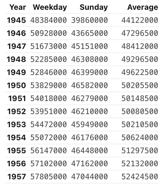
1. Table (25 pts)
You should load the data via a d3.csv call using the
this GitHub URL: https://gist.githubusercontent.com/dakoop/a191fdcc9603800ded912786047fd998/raw/df97c4648967e46e268f01bdd20e661c4bf6884b/newspaper-circulation.csv.
Outside of Observable, this requires including the d3-fetch
library. Once you load the file, you should see an array of objects, one
for each year. In Observable, you can view the output of your code, but
if you’re in another environment, consider using the
console.log function to print your updated data to the
Console (a tab in Developer Tools panel of your browser). The
unprocessed data for 1963 looks like:
{Year: "1963", Weekday: "58905000", Sunday: "46830000", WeekdayEst: " ", SundayEst: " "}Note that the data contains an entry for 1940 and that the entry for
2010 is unspecified (--). We will be processing this data
to first exclude unwanted data, convert the strings to numbers, compute
the average of Weekday and Sunday circulation, and then render a table
of these three values.
a. Data Processing (JavaScript) (10 pts)
In this section, do not use loops. Use Array
functions map, filter, reduce,
and/or forEach. Also, do not change the
order of the data items (i.e. do not sort the array).
Create a new array of objects that removes the rows for the years 1940
and 2010, converts all values to numbers, combines the actual and
estimated values, and computes the average of Weekday and Sunday values
in a new property Average. Do not modify
the array in place; make sure your output is a new array. For 1963, the
new row should be:
{Year: 1963, Weekday: 58905000, Sunday: 46830000, Average: 52867500}When computing the average, you can use the spread syntax to copy over most values and add or overwrite others. The full output is available here.
Hints:
- JavaScript has a unary
plus operator and
parseIntmethod that will convert a string into an integer. - Outside of Observable, make sure your JavaScript occurs after the HTML elements are defined. HTML is processed sequentially. You may also use an onload function.
- When creating a new object, remember that you can put variables
inside of curly braces
(e.g.
{key1: var1, key2: var2}). - Given an object
obj = {key1: var1, key2: var2},{...obj, key2: 13}overwrites the key2 value with the new value 13.
b. Table (JavaScript + HTML) (15 pts)
Once you have verified that your function works correctly, display
the results in text on your web page. If you were not
able to get part a to work correctly, you may use the output here in a JavaScript variable. To create the
table, you will need to dynamically create HTML elements in your web
page. You may either create a <div> element for the
table and add the necessary elements to it using JavaScript, or use
templating to dynamically create the rows. I recommend using Observable,
but you may also use innerHTML
and template
literals. Your table should have 4 columns: one for the year, one
for weekdays, one for Sundays, and one for the average. Add
headers to the top of the table to indicate what is
shown in each column. Your table should be sorted, but do this by
creating a copy of the array using toSorted
(leave the original array unsorted).
Hints:
- When not using templates, JavaScript’s
document.getElementByIdordocument.querySelectorfunction to get a reference to the parentdivelement. - You will probably want to create multiple elements for each year, one for the year and one for each value shown.
- Use a map that uses the object keys to create the individual entries instead of hard-coding them all.
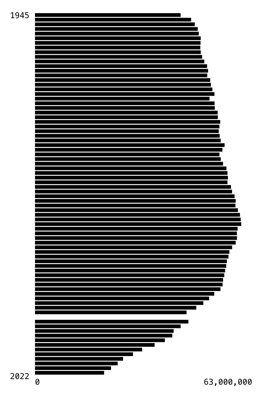
2. Horizontal Bar Chart (25 pts)
Now, let’s create a more visual representation of this data using a bar chart that shows the average circulation using the same data as in Part 1a. Important: The data should be unsorted as in Part 1a! The bar chart should be horizontal, meaning that bars grow from the left to the right side of the canvas. Add axes labels to indicate the starting and ending years as well as range of values. For this assignment, the labels do not need to be precise.
Create an svg element with width 400px and height 600px.
Then, add svg elements using JavaScript to create the bars and labels.
The visualization must accurately represent the data, but you should
experiment with the design of the chart (thickness of lines, number of
labels, spacing, axes scales, colors) to find a visualization that
communicates the data well. Here, templating should again work well, but
you may also use the addEltToSvg helper method we used in
class:
function addEltToSvg(appendTo, name, attrs)
{
    var element = document.createElementNS("http://www.w3.org/2000/svg", name);
    if (attrs === undefined) attrs = {};
    for (var key in attrs) {
        element.setAttributeNS(null, key, attrs[key]);
    }
    if (appendTo) {
        appendTo.appendChild(element);
    }
    return element;
}
Hints:
- In SVG, (0,0) is at the upper-left of the figure.
- Think about how you can map the Year to a y-value. It will be different from the example from class.
- Leave some space for labels!
- It will be easiest to use SVG text elements to add labels. Text elements require a child text node with the text to be displayed.
- Try to use a functional method instead of loops here.
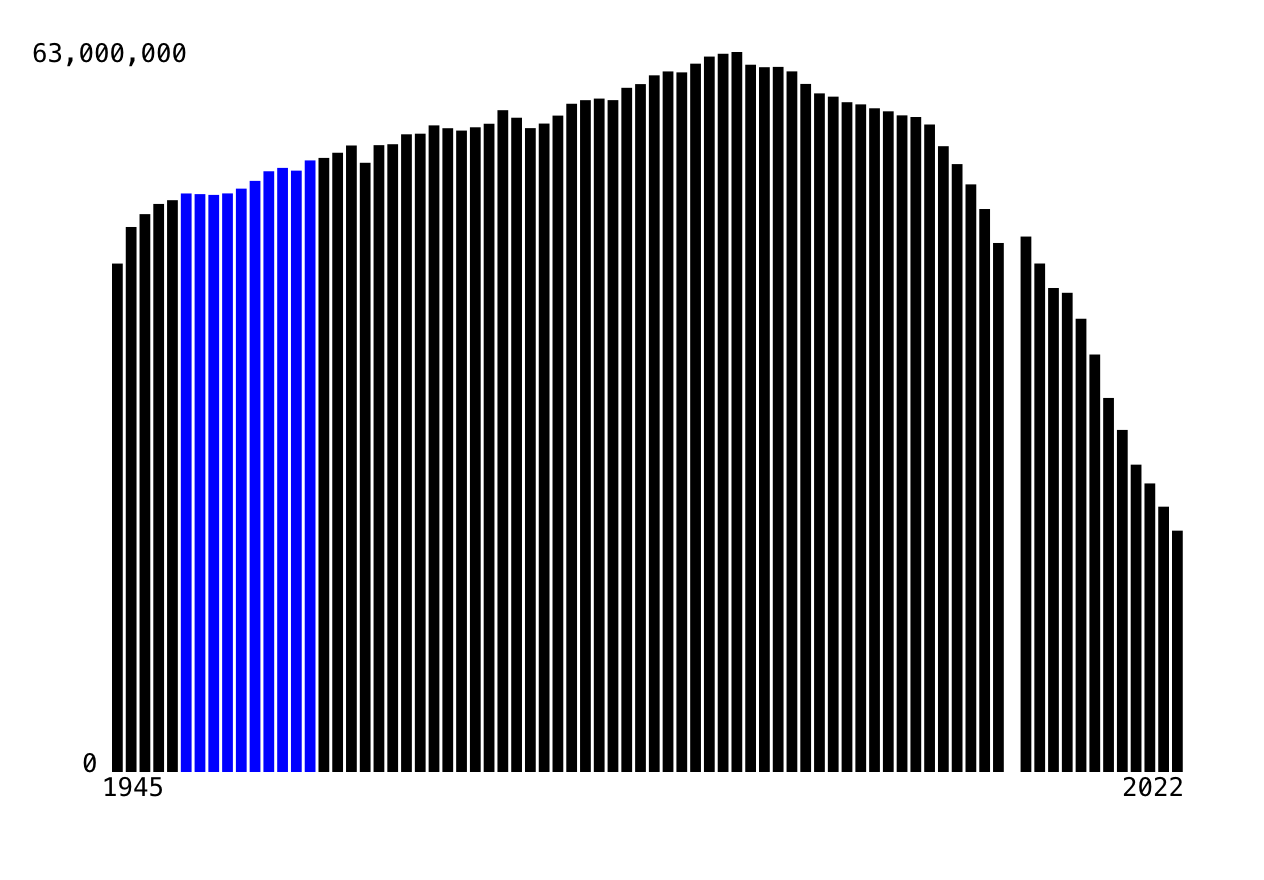
3. Vertical Bar Chart
a. Chart (20 pts)
Now, redo Part 2 but as a vertical bar chart, meaning that bars grow from the bottom to the top of the canvas. Again, add axes labels to indicate the starting and ending years as well as range of values. Again, use JavaScript or templates to add the SVG elements. Here, the SVG is 600x400 pixels.
Hints:
- In SVG, (0,0) is at the upper-left of the figure.
- Remember that the x,y coordinates of a rectangle are also the upper-left so use subtraction to determine the y-coordinate (or a transform).
b. [CS 627] Interaction (15 pts)
Now, update your code for the vertical bar chart so that a user can
highlight a group of bars by decade. Specifically, given the start of a
decade (e.g. 1990), change the appearance of all of
that decade’s bars (e.g. 1990–1999) to stand out from the others. This
should be static; you should not update the highlighted
bar based on where the mouse is. In either case, use the
class attribute to specify the style of the highlighted
bars and write the corresponding CSS to specify the change to the style.
If using Observable, you can use an input to set a
variable that you can use reactively in your template.
viewof decade = html`<input type="range" id="decade" min="1940" max="2020" step="10" value="1940"></input>`;Now, other cells can reference the variable decade and
any time the slider moves, those cells will reactively execute.
The other approach is to add the following HTML after your vertical barchart:
<div id="controls">
  <label for="decade">Decade:</label>
  1940
  <input type="range" id="decade" min="1940" max="2020" step="10" value="1"></input>
  2020
</div>
and JavaScript code:
document.getElementById('decade').onchange=(function() { highlightDecade(this.value); });and finally, define a function highlightDecade that will
highlight the specified decades. (You could also put this directly in
the onchange function if you wish.) In addition, if you
wish to use a different input to trigger the highlighting (e.g. a text
field), this is also ok. However, you may not simply
have the user define the variable (decade = 1990); it must
use an <input> element as we are trying to improve
user interaction.
Hints
- When using templates, the ternary operator can be useful in defining the class attribute. Think about how you test whether a year is in the selected decade.
- If using the other approach, consider updating the code in part a to
assign an id attribute to each bar. Remember ids cannot should not start
with a number! Remember you can change the class attribute of an element
by modifying the DOM via
setAttributecalls.
Extra Credit
- For CS 490 students, Part 3b is extra credit (15 pts)
- For all students, writing code to label each decade is extra credit. Make sure the labels are legible. More points for doing this on the vertical bar chart (5-10 pts)