Assignment 3
Goals
Use different visualization tools, including Tableau, Observable Plot, and Data-Driven Documents (D3), to create a stacked bar chart.
Instructions
You will need to complete this assignment in multiple parts. All the results can be inserted into a single Observable Notebook, but you may submit a web page containing the results as well. You must use Tableau Public (or the Desktop version), Observable Plot, and D3 for this assignment. All D3 visualization should be done using the 7.x version. You may use other libraries (e.g. lodash) as long as they are not used to construct or modify SVGs, but you must credit them in the HTML file you turn in. Tableau offers video tutorials, and Observable Plot has documentation and examples For D3, there is extensive documentation available as well as examples, and Vadim Ogievetsky’s example-based introduction and the bar chart examples that we went through in class are also useful references.
Due Date
The assignment is due at 11:59pm on Friday, October 11.
Submission
You should submit any files required for this assignment on Blackboard. For Observable, do
not publish your notebook; instead, (1) share it with me
(@dakoop) and (2) use the “Export -> Download Code”
option and turn in that file renamed to a3.tar.gz (or
a3.tgz) file to Blackboard. Please do both of these steps
as (1) is easier for me to grade, but (2) makes it possible to persist
the state of the submission. If you complete the assignment outside of
Observable, you may complete the assignment in a single HTML file or use
multiple files (e.g. one for HTML and one for CSS). Note that the files
should be linked to the main HTML document accordingly in a
relative manner (style.css
not
C:\My Documents\Jane\NIU\CSCI627\assignment3\styles.css).
If you submit multiple files, you may need to zip them in order for
Blackboard to accept the submission. The filename of the main HTML
document should be a3.html.
Details
In this assignment, we will again be working with data about the computer science graduates according to data collected by the Integrated Postsecondary Education Data System (IPEDS). This dataset details college and university graduates including the type of degree awarded and the area of study. Rather than using this dataset directly, I have extracted the computer science majors data as a subset that is available as a csv file. This data is available here:
Each data item has the following attributes:
YEAR: the yearCIP_SUBAREA: the subarea of computer science that the student’s degree is in. (See this listing for what this code means.)AWLEVEL: the type of degree awarded (5 for Bachelor’s, 7 for Master’s, and 9 for Ph.D.)CTOTALT: the total number of graduates (missing values have been filled)CTOTALM: the total number of graduates who were allocated as menCTOTALW: the total number of graduates who were allocated as women
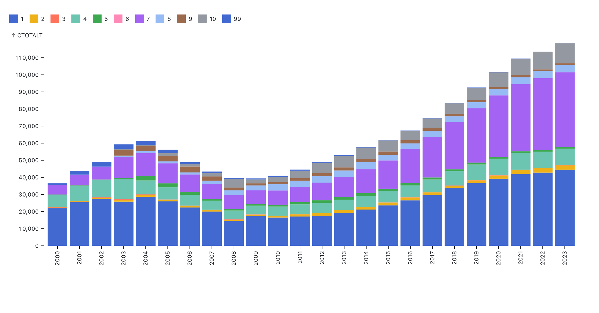
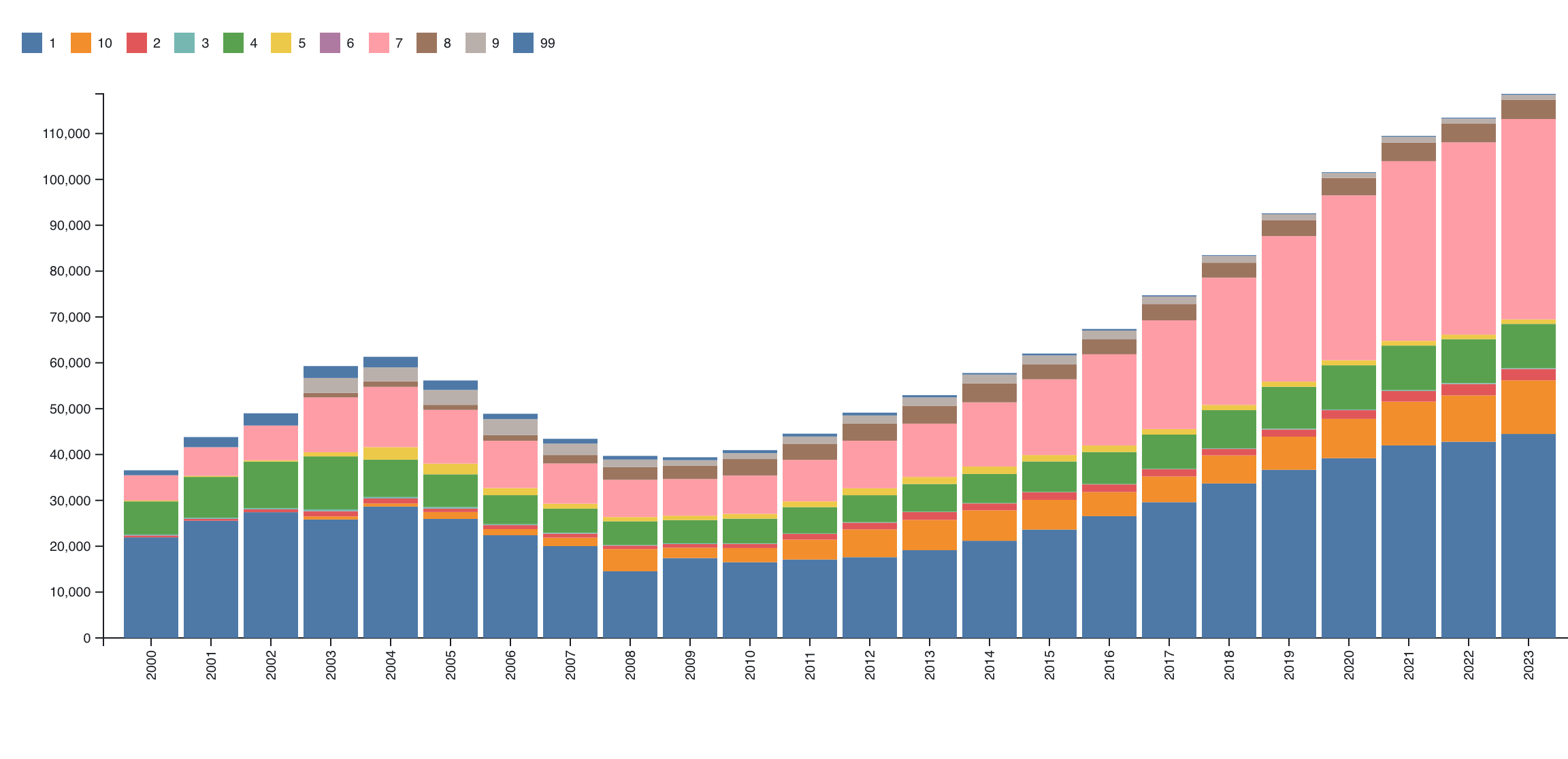
We will be using Tableau (Public), Observable Plot, and D3 to create a vertically stacked bar chart. The visualizations should show each year along the x-axis and a bar with the total number of computer science Bachelor’s graduates each year. That bar should be split into subunits for the different subareas, where each subarea receives its own color. Order the bar fragments appropriately. Provide a legend describing which colors map to which result.
As with Assignment 1, make sure the beginning of your main web page (or notebook) contains the following text:
- Your name
- Your student id
- The course title (“Data Visualization (CS 627/490)”), and
- The assignment title (“Assignment 3”)
If you used any additional JavaScript libraries, please append a note indicating their usage to the text above (e.g. “I used the jQuery library to write callback functions.”) Include links to the libraries used. You do not need to adhere to any particular style for this text, but I would suggest using headings to separate the sections of the assignment.
1. Tableau (25 points)
Either use Tableau Public or download Tableau Desktop and register here to receive a free academic license (You may work before your license arrives using a 14-day trial). Load the CSV file and create a stacked bar chart. If you are using Tableau Public, make sure the publish your visualization (required to save it), and put a link and image in your notebook/web page. If you are using Tableau Desktop and wish to turn in the workbook (.twb file), you may also do that, but put an image in your notebook/web page and a note about the twb file.
Hints
- There is documentation on creating a stacked bar chart available.
- Tableau provides options for the legend ordering and color assignment if you click on the legend (menu in upper-right corner)
- Make sure to filter the data so only Bachelor’s degrees are shown.
- You can choose to group data by year and sum the totals
- Think about which colors to use. We will discuss this design choice more later in the course.
2. Observable Plot (30 points)
Observable notebooks automatically import the d3 and Plot libraries
so you can use them directly. However, if you are using another tool for
this assignment, make sure to include these two libraries. See the documentation
about how to include them, specifically about how to use them in vanilla
HTML or as a UMD bundle. To load the data, use d3.csv
which can load the data from the URL above. Note that converting the
data types after reading the csv or using D3’s autoType
functionality when loading will help avoid parseInt calls
later on. You do not need to match the colors in the example solution,
but you should make sure that your colors are in the same order for each
year. Do not put commas in the year values. Check the margins and make
sure you have a legend.
Hints
- Make sure to filter the data so only Bachelor’s degrees are shown.
- Investigate the
sortoption to order the individual bars in a stack. - Examine the options for the x-axis, including formatting and rotating the tick labels
- Look at the layout options for margins
- There are also many options for the legend
3. D3 (30/45 points)
In this part of the assignment, use D3 to create the same (stacked)
bar chart. CS 490 students need only create a bar chart showing the
totals per year with appropriate axes and labels, but CS 627 students
should create the stacked version with a legend. For both parts, we will
need the data to be organized by year. You can use the following code
which assumes your original data is stored in grads:
gradsByYear = [...d3.group(csGrads, d => d.YEAR).entries()].map(d => ({
  YEAR: d[0],
  CTOTALT: d[1].reduce((s,dd) => s + dd.CTOTALT,0),
  ...Object.fromEntries(d[1].map(dd => [dd["CIP_SUBAREA"], dd["CTOTALT"]]))
}))
This groups the grads by a numeric year, and for each year creates a
new object with the year, the total number of grads
(CTOTALT), and entries for each subarea where the key is
the subarea number, and the value is the number of graduates in that
subarea. CS 490 students can then access the values from the
CTOTALT attribute.
For CS 627 students, it may be easier to first create a non-stacked
bar chart (use the provided method above), and then try the stacked
version. The axes and labels should be similar to Part 2. The stacked
version should have a legend that indicates the relationship between the
bar components and the colors. This legend can be created using the
Swatches code in this notebook. In
Observable, you can do
import {Swatches} from "@d3/color-legend"in one cell and then pass your color scale (color) to
Swatches, appending to another d3 selection divElt as
follows:
const swatches = Swatches(color);
divElt.append(() => swatches)
Note that you’ll want to create a div that holds the SVG and the swatches if you take this approach.
Hints
d3.scaleBandis useful for bar charts.- D3 has routines (e.g.
d3.axisLeft) to build an axis given a scale - A group element with a transform can help shift the entire visualization so that labels or axes have space (margin convention)
- To obtain the maximum yearly total, you can use
d3.maxwith a proper accessor d3.stackmay be useful here. Check how thekeysfunction works with the stack.- If you use
d3.stack, you will need nested selections (note that these groups may be different than you expect)