Assignment 4
Goals
Learn to create geospatial and treemap visualizations and apply colormaps.
Instructions
There are three parts to the assignment. You may complete the assignment in a single HTML file or use multiple files (e.g. one for CSS, one for HTML, and one for JavaScript). You must use D3 v7 for this assignment. All visualization should be done using D3 calls except where instructed otherwise. You may use other libraries, but you must credit them in the HTML file you turn in. Extensive documentation for D3 is available, and Vadim Ogievetsky’s example-based introduction that we went through in class is also a useful reference. This D3 Map Examples may also help.
Due Date
The assignment is due at 11:59pm on Monday, October 31.
Submission
You should submit any files required for this assignment on Blackboard. If you use
Observable, submit the .tar.gz or .tgz file
that is generated from the export menu and rename it to
a4.tar.gz or a4.tgz. If you create your own
files, please make sure the filename of the main HTML document is
a4.html. Any other files should be linked to the main HTML
document accordingly relatively. Blackboard may
complain about the files; if so, please zip the files and submit the zip
file instead.
Details
In this assignment, we will examine field crops data. This data comes from the USDA’s Census of Agriculture through the QuickStats service. Specifically, we are interested in how much of a particular crop each state (and region) produces. This data has been extracted and is available online. To create maps, we will use data with the outlines of each US state. This file is in a GeoJSON format that D3 can more easily handle. In addition, the boundaries have been simplified. The goal of the assignment is to understand crop production across the US.
Data Links
- US State Boundaries GeoJSON: https://gist.githubusercontent.com/dakoop/7cc2cf0eefc52d8f575bd472ba531954/raw/0e7a2dc3021459a2bf97350d9921f1e2a8c9703c/us-status.geojson
- Crop Production by State & Year: https://gist.githubusercontent.com/dakoop/7cc2cf0eefc52d8f575bd472ba531954/raw/0e7a2dc3021459a2bf97350d9921f1e2a8c9703c/field-crops.json
- Agricultural Regions: https://gist.githubusercontent.com/dakoop/7cc2cf0eefc52d8f575bd472ba531954/raw/0e7a2dc3021459a2bf97350d9921f1e2a8c9703c/ag-regions.json
- Full Gist: https://gist.github.com/dakoop/7cc2cf0eefc52d8f575bd472ba531954
0. Info
Like Assignment 1, make sure your assignment contains the following text:
- Your name
- Your student id
- The course title (“Data Visualization (CSCI 627/490)”), and
- The assignment title (“Assignment 4”)
If you used any additional JavaScript libraries or code references, please append a note to this section indicating their usage to the text above (e.g. “I used the jQuery library to write callback functions.”) Include links to the projects used. You do not need to adhere to any particular style for this text, but I would suggest using headings to separate the sections of the assignment.
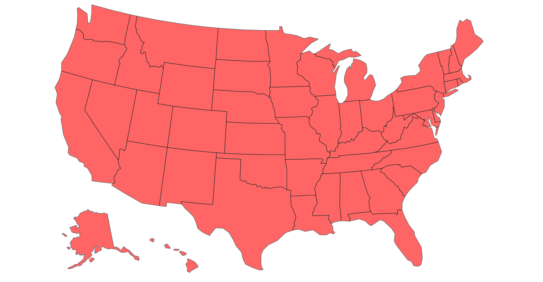
1. State Map (25 pts)
1a. Base Map (15 pts)
Create a map that shows the state boundaries using the Albers USA Projection. You will only need the GeoJSON data for this part of the assignment.
For the map, you will want to use each state as a separate feature.
You can access mapData.features to obtain this array. Make
sure that you filter the list of features to include only those states
listed above! Each feature has a number of properties that can be useful
for the next steps. If you wish, you could implement a tooltip using the
Name attribute to show a state’s name (for a data item
d, this is stored in d.properties.name). You
can load the mapData via d3.json.
Hints
- Each state is a feature so if
mapDatais the variable loaded byd3.json,mapData.featuresis a list of all of the states. d3.geoPathcan have an associated projection is used to translate GeoJSON features into paths on screen.
1b. Agricultural Regions (10 pts)
Create a second US Map that colors the states based on the
agricultural region they belong to. The regions are defined by the
ag-regions.json file. However, these regions are defined so
that the regions are the keys and the list of states in the region are
the values. In order to color the states, we want to look up the region
given the state. It is probably worth creating a new lookup from the
original data in the form of a Map
or an Object that looks something like
{"Illinois": "Heartland", "Michigan": "Great Lakes", ...}
Pick an appropriate colormap for this data, and note that there are 12
regions. A list of color schemes is here.
Hints
- To invert the mapping, consider using
Object.entriesand then inverting the entries Array.flat()may help building the lookup.- 12 colors can be problematic. Why does this not cause problems for this type of map?
2. Crop Production by State (40 pts)
You will create two visualizations, but you should work to create a single function to facilitate most of the work, passing data accessor functions and color scales as necessary. It may be easier to first create the visualizations individually and then refactor them.
a. 2020 Hay Production by State (20 pts)
Using the crop production data in concert with the GeoJSON data, create a new choropleth map that shows the hay production by state. The colormap should accurately convey the amount for each state. Create a legend so a viewer can understand the values.
The crop production data is of the form:
[{State: "ALABAMA", Year: 2020, HAY: 750000, CORN: 320000, WHEAT: 70000, SOYBEANS: 275000, OATS: null, BARLEY: null},
 {State: "ALABAMA", Year: 2021, HAY: 700000, CORN: 340000, WHEAT: 110000, SOYBEANS: 305000, OATS: null, BARLEY: null},
 {State: "ALABAMA", Year: 2022, HAY: 700000, CORN: 290000, WHEAT: 120000, SOYBEANS: 355000, OATS: null, BARLEY: null},
 ...
For this part, you will need to extract the 2020 hay data only, and
as with Part 1, I would suggest writing code to transform the hay
production data into a Map
of the form
{"ILLINOIS": 11200000, "INDIANA": 5250000, ...}.
You will need to match the data in the GeoJSON file with the data in
the corn production JSON file. Given a GeoJSON feature d,
the state name (name) is accessed from the
properties object as d.properties.name. Note
that the state name in the crop data file is in all upper-case letters
while the one in the GeoJSON map file is mixed-case. You can convert a
string to upper-case using toUpperCase().
b. 2020-2021 Corn Production Difference by State (20 pts)
Create a second choropleth visualization, but now show the change in corn production from 2020 to 2021 It should be clear from the visualization whether the value increased or decreased and by how much. This will be a different colormap than in part a. Again, add a legend.
You will need to calculate the difference between 2021 and 2020 for
each state. To do, one option is to use d3.group
to group the data by state and year and then use that map to calculate
the difference for each state. As with Part 1, I would suggest trying to
create a Map
of the form {"ILLINOIS": 1000000, "INDIANA": 430000, ...}
before passing the data to your function that creates the map.
Hints
- If you craft your function to create the map in Part 1 well, you can use reuse that function and just update the fill based on the corn production data.
- The Map constructor can be created from an iterable of key-value pairs.
- Use Map.get to access a map’s value by key passing the key.
d3.scaleSequentialcan help with colormapping. Remember to check the type of the values you are displaying to determine a correct colormap.- To create a good colormap, think about what the domain of the values is.
- To create a nice legend, consider using (with proper attribution) M. Bostock’s color ramp approach.
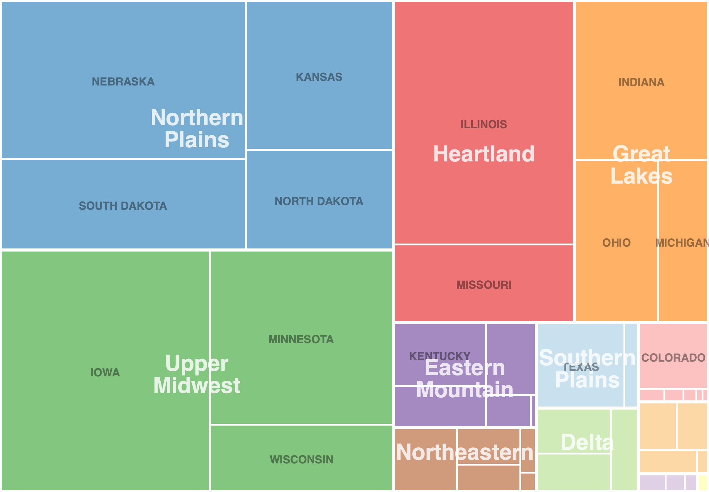
3. [CS 627 Only] Crop Production Treemap (40 points)
Now, we wish to better understand crop production by state and agricultural regions. To do so, we can create a treemap using the values for a particular crop (e.g. corn) and the hierarchy ag region -> state. To help users understand the data, we will label the agricultural regions and states, but we can do this selectively so states and regions with little production are not labeled.
To create the hierarchy, we can first group the data by ag region and
state. Then, we can pass this result to d3.hierarchy
to build the tree. Note that maps can be passed directly without
transformation. Make sure to specify which attribute to sum and how to
sort. We can now pass this hierarchy to the d3.treemap layout
function to calculate the rectangles. Use the squarify layout (this is
the default).
From the treemap t, you can extract all leaves via
t.leaves() to draw the visualization. Use the
x0, x1, y0, y1 coordinates to draw each leaf rectangle. The
color should reflect the ag region. Add tooltips for the region and
state and value. Create treemaps for 2021 for hay,
corn, and soybeans.
Hints
- After creating the hierarchy, you can get a node’s parent via the
.parentproperty. All leaves will be at the same depth so you can extract all nodes for regions via the correct mapping of leaves to parents (or grandparents). - A
Setwill eliminate duplicated nodes (e.g. from regions, states) - Make sure your
selectAllstatements do not select already created objects! For example, callingsvg.selectAll(text)twice on the same svg will bind the already created rectangles on the second call. You can attach a class name (text.region) to the object type to avoid this. - Data for a property
fooof a leafdin stored ind.data.foo, but extracting a state/region label is atd.data[0]. - Labels can be centered at a particular point by using the
text-anchor: middlestyle property.
Extra Credit
For extra credit, CS 490 students may complete Part 3. In addition, all students may implement a way for users to interactively update which year (or year range) is shown (year for Part 2a, range for Part 2b or Part 3). Use D3 transitions to animate the change from one year (or year range) to the other.