Assignment 4
Goals
Learn to create geospatial and treemap visualizations and apply colormaps.
Instructions
There are three parts to the assignment. You may complete the assignment in a single HTML file or use multiple files (e.g. one for CSS, one for HTML, and one for JavaScript). You should use D3 v7 and Observable Plot for this assignment as directed (Part 1 using D3, Parts 2&3 using either or both). You may use other libraries, but you must credit them in the HTML file you turn in. Extensive documentation for D3 is available, and Vadim Ogievetsky’s example-based introduction that we went through in class is also a useful reference. This D3 and Observable Map Examples may also help.
Due Date
The assignment is due at 11:59pm on Friday, November 10.
Submission
You should submit any files required for this assignment on Blackboard. For Observable, do
not publish your notebook; instead, (1) share it with me
(@dakoop) and (2) use the “Export -> Download Code”
option and turn in that file renamed to a4.tar.gz (or
a4.tgz) file to Blackboard. Please do both of these steps
as (1) is easier for me to grade, but (2) makes it possible to persist
the state of the submission. If you complete the assignment outside of
Observable, you may complete the assignment in a single HTML file or use
multiple files (e.g. one for HTML and one for CSS). Note that the files
should be linked to the main HTML document accordingly in a
relative manner (styles.css
not
C:\My Documents\Jane\NIU\CSCI627\assignment4\styles.css).
If you submit multiple files, you may need to zip them in order for
Blackboard to accept the submission.
Details
In this assignment, we will examine information about corn and soybean production in Illinois. This data comes from the USDA’s Census of Agriculture through the QuickStats service. Specifically, we are interested in how much of each crop different counties and agricultural districts produce in Illinois. This data has been extracted and is available online. To create maps, we will use data with the outlines of each Illinois county. This file is in a GeoJSON format that D3 and Observable Plot can handle. In addition, the boundaries have been simplified. The goal of the assignment is to understand crop production across Illinois.
Data Links
- Illinois County Boundaries GeoJSON: https://gist.githubusercontent.com/dakoop/d06705a420fb348e7e03c7437bbfe4cb/raw/172303390752b7a224d876582043240ee9e9bd9b/il-counties.geojson
- Illinois Crop Production by County: https://gist.githubusercontent.com/dakoop/d06705a420fb348e7e03c7437bbfe4cb/raw/172303390752b7a224d876582043240ee9e9bd9b/il-crops.json
- Full Gist: https://gist.github.com/dakoop/d06705a420fb348e7e03c7437bbfe4cb
0. Info
Like Assignment 1, make sure your assignment contains the following text:
- Your name
- Your student id
- The course title (“Data Visualization (CSCI 627/490)”), and
- The assignment title (“Assignment 4”)
If you used any additional JavaScript libraries or code references, please append a note to this section indicating their usage to the text above (e.g. “I used the jQuery library to write callback functions.”) Include links to the projects used. You do not need to adhere to any particular style for this text, but I would suggest using headings to separate the sections of the assignment.
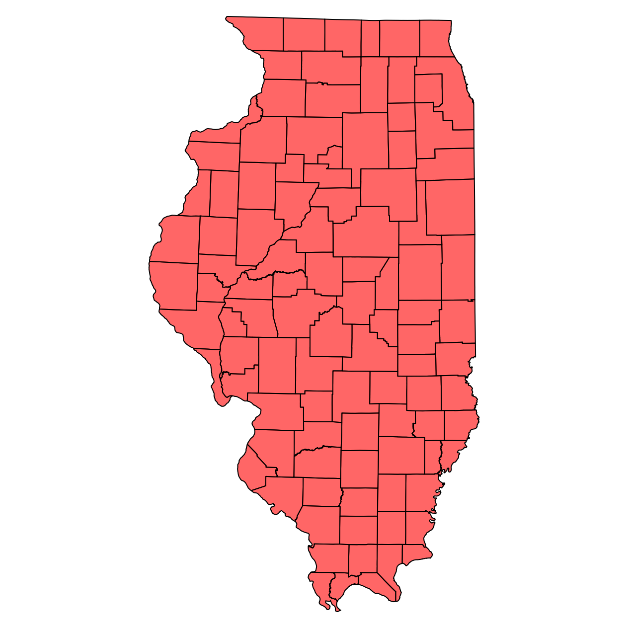
1. Illinois Map (25 pts)
1a. Base Map (15 pts)
Create a map that shows the Illinios county boundaries. You will only need the GeoJSON data for this part of the assignment. Use D3 for this part of the assignment.
Remember that you will need a projection for the map. For this assignment, we will use the Illinois East State Plane projection. Noah Veltman has provided a handy list of these in d3.geo format here.
For the map, you will want to use each state as a separate feature.
You can access mapData.features to obtain this array. Make
sure that you filter the list of features to include only those states
listed above! Each feature has a number of properties that can be useful
for the next steps. If you wish, you could implement a tooltip using the
COUNTY_NAM attribute to show a county’s name (for a data
item d, this is stored in
d.properties.COUNTY_NAM). You can load the mapData via
d3.json.
Hints
- Each state is a feature so if
mapDatais the variable loaded byd3.json,mapData.featuresis a list of all of the states. d3.geoPathcan have an associated projection is used to translate GeoJSON features into paths on screen.
1b. Agricultural Districts (10 pts)
Create a second Illinois map that colors the states based on the
agricultural district they belong to. The districts are defined by the
“Ag District” property in the crop production json. In order to color
the counties, we want to look up the district given the county. In the
GeoJSON file you used in Part 1a, there is a CO_FIPS
property that can be used to match with the County ANSI
value in the crop production json file. It is probably worth creating a
new lookup from the original data in the form of a Map
or an Object that looks something like
{31: "NORTHEAST", 139: "EAST SOUTHEAST", ...} where the
keys are the County ANSI values, and the values are the Ag
Districts. Pick an appropriate colormap for this data. A list of color
schemes is here.
Hints
- Remember the array functions to help build the map between county codes and districts.
2. Crop Production by County (45 pts)
You may use either D3 or Observable Plot (or both) for this part of the assignment. You will create three visualizations with different colormaps.
a. 2022 Corn Harvested (15 pts)
Using the crop production data in concert with the GeoJSON data, create a new choropleth map that shows the 2022 corn harvest by county. The colormap should accurately convey the amount for each state. Create a legend so a viewer can understand the values.
The crop production data is of the form:
[[{"Ag District":"CENTRAL","County":"DE WITT","County ANSI":39.0,"LAND AREA":254409.0,"cornPlanted":{"2002":99000.0,"2012":112000.0,"2022":102500.0},"cornHarvested":{"2002":98000.0,"2012":110500.0,"2022":100600.0},"soybeansPlanted":{"2002":95000.0,"2012":92000.0,"2022":100500.0},"soybeansHarvested":{"2002":94700.0,"2012":91600.0,"2022":100100.0}},
{"Ag District":"CENTRAL","County":"LOGAN","County ANSI":107.0,"LAND AREA":395556.0,"cornPlanted":{"2002":182000.0,"2012":217000.0,"2022":178500.0},"cornHarvested":{"2002":180100.0,"2012":213000.0,"2022":175700.0},"soybeansPlanted":{"2002":162000.0,"2012":119000.0,"2022":153000.0},"soybeansHarvested":{"2002":161700.0,"2012":118300.0,"2022":152500.0}},
 ...
For this part, you will need to use only the 2022 corn data. As with
Part 1, I would suggest writing code to create a Map
so that given a County ANSI value, you can obtain its data.
Given a GeoJSON feature d, a county’s properties are
accessed from the properties object as
d.properties. Thus, d.properties.CO_FIPS gives
the county’s code.
b. 2022 % Corn Acres Harvested (15 pts)
Create a second choropleth visualization, but this time, show the
percentage of corn acres harvested out of the total
number of acres of land in the county (LAND AREA). This
provides a clearer picture of which counties are producing a lot of corn
by taking their size into account. Make sure to provide a legend.
c. 2022 Corn-Soybean Difference (15 pts)
Create a third choropleth visualization, but this time, show the difference in the percentage of corn acres vs. soybean acres. You still should be able to compute this directly, given the a map from the county code to the data for that county. You will need to use a different colormap than in part a. Again, add a legend.
Hints
- Some counties do not have values for the given data. How should you
represent them? Think about the colormap you are using. In Plot,
consider the
unknownoption. In D3, check if the value is null before passing it to the scale. - If you craft your code to create the map in Part 1b well, you can create a function to do Part 2.
- The Map constructor can be created from an iterable of key-value pairs.
- Use Map.get to access a map’s value by key passing the key.
- Color scales for Observable Plot are documented here
- In D3,
d3.scaleSequentialcan help with colormapping. Remember to check the type of the values you are displaying to determine a correct colormap. - To create a good colormap, think about what the domain of the values is.
- To create a nice legend in Observable Plot, use the legend option associated with color. Make sure to label the legend appropriately.
- To create a nice legend in D3, consider using (with proper attribution) M. Bostock’s color ramp approach.
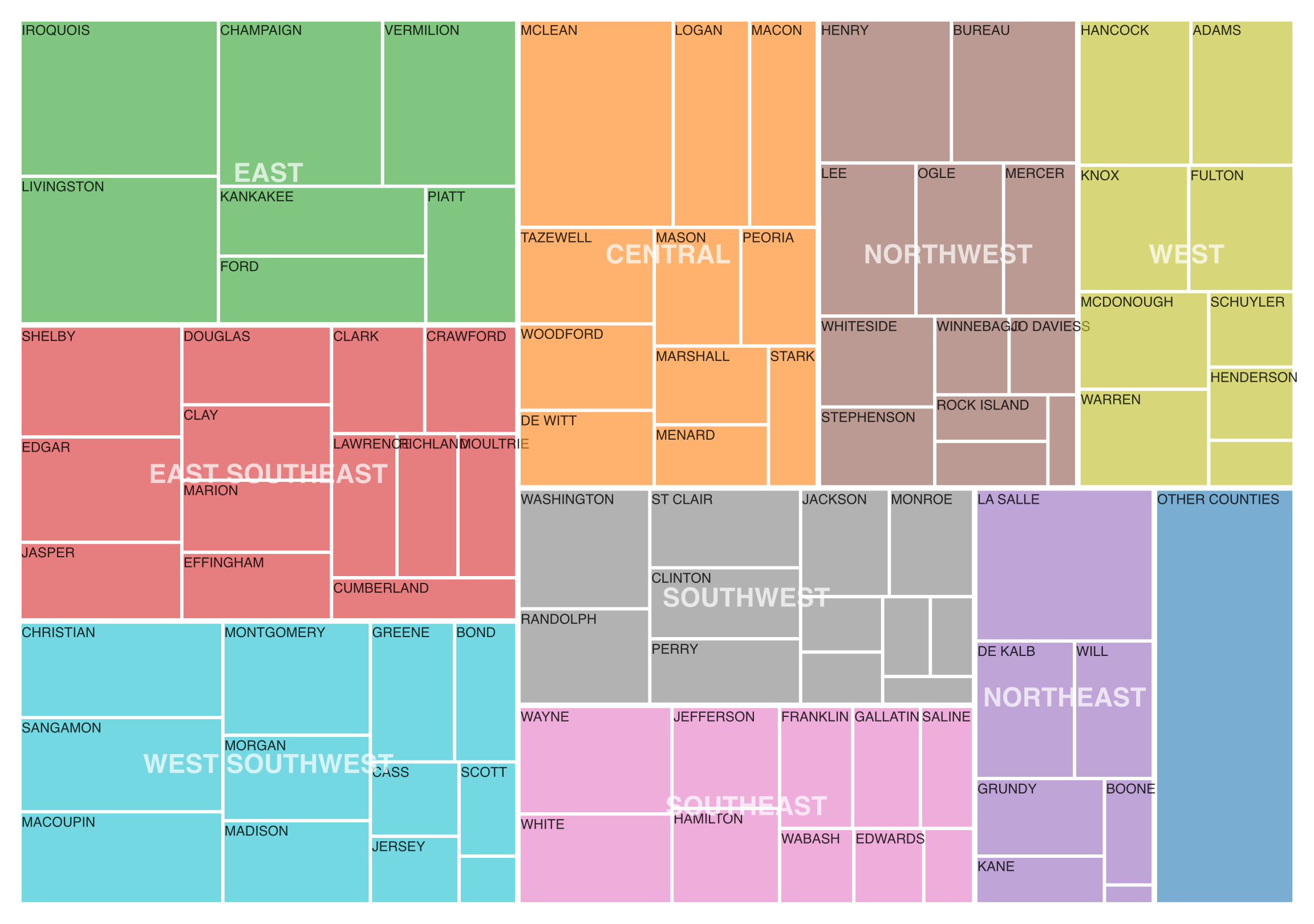
3. [CS 627 Only] Corn Harvest Treemap (40 points)
Now, we wish to better understand crop production by county and agricultural district. To do so, we can create a treemap using the values for a particular crop (e.g. corn) and the hierarchy ag district -> county. To help users understand the data, we will label the agricultural districts and counties, but we can do this selectively so counties with little production are not labeled. You may use D3 or Observable Plot or both for this part. D3 contains the functions to create the hierarchy and treemap.
To create the hierarchy, we can first group the data by ag district
and conuty using d3.group. Then, we can pass this result to
d3.hierarchy
to build the tree. Note that maps can be passed directly without
transformation. Make sure to specify which attribute to sum and how to
sort. We can now pass this hierarchy to the d3.treemap layout
function to calculate the rectangles. Use the squarify layout (this is
the default).
From the treemap t, you can extract all leaves via
t.leaves() to draw the visualization. Use the
x0, x1, y0, y1 coordinates to draw each leaf rectangle. The
color should reflect the ag district. Add a tooltip that shows the ag
district, county, and value, when a county is highlighted. Create a
treemaps for the 2022 Corn Harevst.
Hints
- After creating the hierarchy, you can get a node’s parent via the
.parentproperty. All leaves will be at the same depth so you can extract all nodes for districts via the correct mapping of leaves to parents (or grandparents). - A
Setwill eliminate duplicated nodes (e.g. from districts) - Make sure your
selectAllstatements do not select already created objects! For example, callingsvg.selectAll(text)twice on the same svg will bind the already created rectangles on the second call. You can attach a class name (text.district) to the object type to avoid this. - Data for a property
fooof a leafdin stored ind.data.foo, but extracting a district/county label is atd.data[0]. - Labels can be centered at a particular point by using the
text-anchor: middlestyle property.
Extra Credit
For extra credit, CS 490 students may complete Part 3. In addition, all students may implement a way for users to interactively update which year (or crop) is shown for the visualizations shown in Part 2 or Part 3 (up to 20 points).