Assignment 5
Goals
The goal of this assignment is to work with data and data management tools for spatial, graph, and temporal analysis.
Instructions
You may choose to work on this assignment on a hosted environment
(e.g. Google Colab) or
on your own local installation of Jupyter and Python. You should use
Python 3.12 or higher for your work. To install Python, consider using
uv, miniforge, or Anaconda. Also, install JupyterLab (or Jupyter
Notebook). For this assignment, you will need to make sure the polars,
geopandas, shapely, and neo4j-python-driver packages are installed. If
you have trouble loading parquet files, install pyarrow
(conda install pyarrow). In addition, download neo4j.
In this assignment, we will be working with data from the Federal Aviation Administration and from its ADB-B system. The goal is to load the data and understand the air traffic control regions and there relationship to airports and flight paths. We will we using data from November 17, 2025, gathered and made available by adsb.lol. This data has been significantly processed from its raw form. There are three datasets:
- Primary Airport Locations: airports.parquet
- Air Route Traffic Control Center (ARTCC) Boundaries: artcc-boundaries.geojson
- Flight Paths from ADS-B Data: flights-2025-11-17.parquet
Due Date
The assignment is due at 11:59pm on Friday, December 5.
Submission
You should submit the completed notebook file named
a5.ipynb on Blackboard. Please use Markdown
headings to clearly separate your work in the notebook.
Details
CS 640 students are responsible for all parts; CS 490 students do not need to complete Part 4. Please make sure to follow instructions to receive full credit. Use a markdown cell to Label each part of the assignment with the number of the section you are completing. You may put the code for each part into one or more cells.
1. Data Ingest (5 pts)
Use geopandas to load the ARTCC boundaries GeoJSON file and the airport locations parquet file. These files already identify their associated geometry; for the boundaries, this is a polygon, and for the airports, this is a point. Also, use polars (or pandas) to load the flight traces parquet file. This file contains entires with the icao (a unique 24-bit identifier assigned to an aircraft), flight_id (an identifier that distinguishes different flights by the same aircraft), datetime, lat, lon, altitude, speed, and information about the aircraft.
2. Spatial Processing
The flights data is composed of coordinates but this does not tell us which the airports that the flights start and end at, nor the air route traffic control centers they pass through. We will add this information so we can analyze traffic at airports and through different traffic control areas. We will also generate visualizations of this data.
a. Add Airports to Flights (15 pts)
We wish to relate the start and end locations for each flight to the
airports. Create a new dataframe that has icao,
flight_id, start_dt, end_dt,
origin_apt, and dest_apt columns. The
start_dt and end_dt columns should contain the
starting and ending timestamps for each flight, while the
origin_apt and dest_apt columns should contain
the nearest airport to the starting and ending positions of each flight,
respectively. It will be easiest to first compute the raw data
corresponding to the start and end of the flight before worrying about
the spatial join. In other words, create a dataframe that identifies the
start_dt, start_lat, start_lon,
end_dt, end_lat, and end_lon for
each flight, in addition to the icao and
flight_id columns.
Then, create a geopandas GeoDataFrame with the starting and ending
positions as points. Whenever you create a geopandas GeoDataFrame from
latitude and longitude, make sure to set the coordinate reference system
(crs) to the string “EPSG:4326”. Next, you will need to compute a
spatial join to find the nearest airports. You will need to do
two spatial joins, one for the origin and one for the
destination. Note that you must first identify the starting and ending
positions for each flight. Then, use the geopandas
sjoin_nearest function to find the nearest airport to each
of the positions.
Hints
- Important: Longitude is the x-coordinate, and latitude is the y-coordinate!
- To create the lat/lon point geometries, you can using geopandas points_from_xy function.
- Use a group_by with the correct aggregations to obtain the start and end positions.
- In polars, you can get the rows associated with the minimal or
maximal value using
arg_minandarg_max, respectively. These also work inside of aggregations.
b. Convert Flights to LineStrings (15 pts)
In order to analyze the paths of the flights, we need to convert the
lat/lon sequences for each flight into a linestring geometry (a sequence
of line segments). You can do this by grouping the data by
icao and flight_id and then aggregating the
lat and lon columns into a list of
coordinates. Then, you can use shapely’s LineString
constructor to convert the list of coordinates into a linestring. Create
a new GeoDataFrame that has the icao,
flight_id, and this new geometry. Join this with your
dataframe from Part a so that you have a single GeoDataFrame with the
icao, flight_id, start_dt,
end_dt, origin_apt, dest_apt, and
geometry columns.
Hints
- If you choose to construct the list of coordinates in polars
(recommended), the
concat_listfunction may be very useful. - Again, make sure your coordinates have longitude first and latitude second.
- To create a linestring from a list of coordinates, you can use
geopandas’
applymethod in coordination with an assignment to the geometry column.
c. ATC Traffic (10 pts)
Now perform a spatial join between the flight paths and the ARTCC
boundaries to determine which traffic control areas each flight passes
through. You can use geopandas’ sjoin function with the
'intersects' operation to compute this. After performing
the spatial join, create a new dataframe that has the icao,
flight_id, and a list of the unique name
values for the ATC areas that each flight passes through. The following
table shows information for ten random flights. Note that the
artcc_name column contains a list of ATC area names; it is
displayed as a list for succinctness, not because this is the format
your dataframe should be in.
| icao | flight_id | origin_apt | dest_apt | artcc_name |
|---|---|---|---|---|
| str | u32 | str | str | list[str] |
| “abd19e” | 1 | “ATL” | “MCO” | [“ZMA”, “ZJX”, “ZTL”, “ZDC”] |
| “ad000d” | 4 | “RDU” | “ATL” | [“ZTL”, “ZDC”] |
| “a613e7” | 2 | “AUS” | “DEN” | [“ZHU”, “ZAB”, “ZFW”, “ZDV”] |
| “a3e542” | 2 | “PHX” | “ABQ” | [“ZAB”] |
| “ad7282” | 3 | “MCI” | “EWR” | [“ZNY”, “ZOB”, “ZAU”, “ZKC”] |
| “a752ea” | 3 | “ATL” | “BOS” | [“ZNY”, “ZTL”, “ZDC”, “ZBW”] |
| “a5449a” | 1 | “DFW” | “SAN” | [“ZAB”, “ZFW”, “ZLA”] |
| “ac2b80” | 2 | “PDX” | “PHX” | [“ZAB”, “ZLA”, “ZLC”, “ZSE”] |
| “a38ad5” | 4 | “DCA” | “MSY” | [“ZMA”, “ZJX”, “ZDC”, “ZHU”] |
| “a2615e” | 1 | “PDX” | “SFO” | [“ZOA”, “ZSE”] |
3. Visualization
a. Visualize Airports (5 pts)
Use geopandas to plot the locations of the airports. You can use the
plot command on a GeoDataFrame for this.
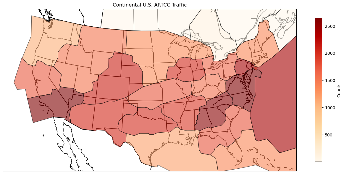
b. Visualize Traffic (15 pts)
Now, use the atc traffic data from Part 2c to generate a plot showing
the number of flights passing through each ATC area. This requires
creating a new data frame by aggregating the flights by ATC area. Then,
use the plot command to generate a choropleth map from the
GeoDataFrame. This is done by choosing a column to serve as the value in
the map and setting a colormap (cmap).
4. ATC Handoffs
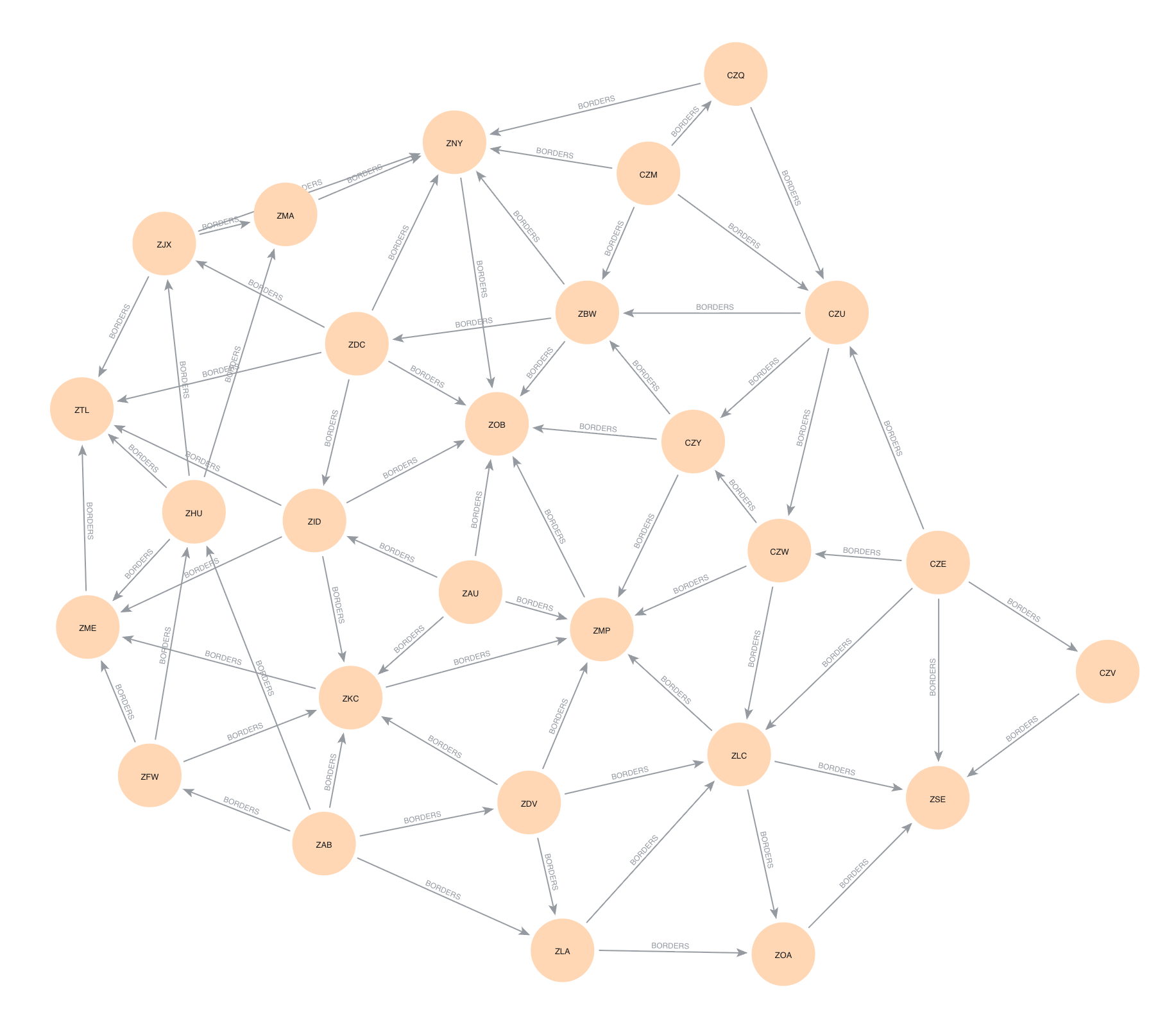
One of the interesting aspects of air traffic control is how flights are handed off between different control centers as they move through the airspace. In Part 2c, we saw the ATCs that each flight passed through, but we did not check if this was optimal. For example, if a flight passed through ATC areas A, B, and C, but it could have gone directly from A to C (skipping B), then we would like to identify this. While our current flights data frame contains the origin and destination airports as well as the ARTCCs that are intersected, we can map these to the origin and destination ATC areas. We will compute the shortest path between these two areas and see which ATC areas are on that path. To do this, we will use a graph database, neo4j, to analyze the paths between ATC areas. This requires path-type queries over a graph of ATC regions connected by edges when they border each other. Note that this is not necessarily optimal routing as going far out of the way to avoid handoffs is not desirable.
a. Bordering Areas (10 pts)
First, we need to determine a graph of ATC areas where an edge
indicates that the ATC areas border each other. To do this, we will
compute the spatial join of ATC areas with themselves. There are a
number of operations that can be used for a spatial join, but to make
sure that areas with common borders are joined, we will use
'intersects'. Make sure to get rid of pairs of the same
area and deduplicate those that are listed twice.
b. Graph Database Creation (20 pts)
To begin, we will create a new graph database and add a Local DBMS to neo4j. Do this in the neo4j desktop application by creating a new project and creating a Local DBMS associated with that project. You may wish to stop other databases from running, and then start the new DBMS you just created. If you click on the newly created DBMS, you will see the IP address and Bolt port; copy the bolt url. Back in Jupyter, we now wish to connect to this DBMS. Use the following code (potentially with a different url as copied) to connect with the password you created:
from neo4j import GraphDatabase
driver = GraphDatabase.driver("bolt://localhost:7687", auth=("neo4j", "password"))
Updated 2025-11-26 Since we have less than 100 pairs
of bordering ATC areas, we can insert them all at once. Construct a
Cypher query to insert the nodes and relationships into the database.
The UNWIND
clause will take a list of 2-tuples/lists and can create the nodes and
relationships.
query = """
UNWIND $batch AS edge
// add origin node
// add destination node
// add borders relationship between them
"""

with driver.session() as session:
    session.run(query, batch=edges)
Once you have created this correctly, you can visualize the graph using the Bloom tool that comes with neo4j Desktop. You can do this using the “Explore” tool.
Hints
- The
MERGEclause in Cypher will create a node or relationship only if it does not already exist. TheCREATEclause will always create a new node or relationship. - neo4j creates directed relationships, but this is ok because we can still query in an undirected manner.
- See this post for more advanced methods to structure the Cypher queries to insert nodes and relationships.
- If your neo4j database has extra nodes or edges that were incorrectly created, you can start from scratch by “Remove”-ing the DBMS in the desktop application and then create a new Local DBMS. The port information should stay the same.
c. Compute Paths (20 pts)
Next, we wish to use the graph database to compute the potential handoffs from the flights data. We need to compute the unique starting and ending ATC areas over all of the flights, and then we can compute the shortest path between the areas. For each flight, we wish to find the shortest path between the starting and ending ATC areas. (Note that this path is not unique.) Make sure to exclude the cases where the starting and ending ATC areas are the same, as these do not require any handoffs. From the results of the query, create a dataframe with the counts of the number of times an ATC was part of a flight’s path. Add the count of the flights that started and ended in the same ATC to this dataframe. Finally, take the flights dataframe from Part 2c and combine it with this handoffs information to get the total number of flights that would pass through each ATC area using shortest paths.
Hints
- Cypher has a
SHORTESTkeyword to compute the shortest path for a path expression - In a path query,
(n1)-[:EDGE_TYPE]-(n2)is undirected while(n1)-[:EDGE_TYPE]->(n2)is directed. We don’t care which way the edge goes when analyzing a path. - You can hold onto the result by assigning using
= - Given a path as its argument, the
nodesfunction returns the list of nodes along that path. - You can use the
reducefunction to pull out only some of each node’s information (e.g. its area number). See this post for some ideas. - Combining the two dataframes will involve some thought about how to count everything correctly.
d. Visualization (5 pts)
Generate a plot showing the number of flights that would pass through each ATC based on the paths computed in Part c. This plot should look similar to Part 2b. What has changed?

5. [CS 640 Only] Temporal Analysis (25 pts)
Next, we wish to analyze the temporal patterns of flight activity. We can count the number of flights that are in the air at each minute of the day. Note that the data is in UTC time so you do not need to do any timezone conversions.
You can compute the number of active flights by associating the values +1 and -1 with the start and end of each flight, sorting all of these events by time, and then calculating the cumulative sum of these values over time. However, these values will not be binned into regular time intervals. Therefore, you will need to resample the data into regular intervals (try 10-minute and 20-minute intervals). Create plots of this interval data to see any patterns of activity. Where is there a dip in activity? Why might this be? (remember the data is in UTC!) Why is the activity so low at the very beginning and end of the day; is this real or an artifact of the data we are examining?
Hints
- Use polars
cum_summethod to compute cumulative sums. - It may be easier to not use a true resampling here, but rather to
create a date_range
with the desired frequency, and then do a join with the cumulative sum
data using the
join_asofmethod. Make sure to fill in any missing values with the previous value.
Extra Credit
- CS 490 students may do Part 4 for extra credit
- Improve the visualizations by using cartopy or another mapping library to show the outlines of the US states.
- Compute ATC traffic maps by time of day.
- Compare traffic for different airports (e.g. ORD vs. MDW).
- Take raw data from adsblol and create data for another day.