Assignment 5
Goals
The goal of this assignment is to work with data and data management tools for spatial, graph, and temporal analysis.
Instructions
You may choose to work on the second part of the assignment on a
hosted environment (e.g. Google Colab) or on your
own local installation of Jupyter and Python. You should use Python 3.8
or higher for your work (although Colab’s 3.6 should work). To use cloud
resources, create/login to a free Google account for Colab. If you choose to
work locally, Anaconda
is the easiest way to install and manage Python. If you work locally,
you may launch Jupyter Lab either from the Navigator application or via
the command-line as jupyter-lab.
For this assignment, you should install the neo4j database, its
python driver, and the geopandas and descartes python libraries. First,
download neo4j 5.3. Then, use
conda (or mamba/pip) to install the neo4j python driver and the
geopandas and descartes libraries
(conda install neo4j-python-driver geopandas descartes). We
will use geopandas for spatial work and neo4j for graph queries.
In this assignment, we will be working with data from the Divvy Bike Share Program in the Chicagoland area. The goal is to load the data and understand the community areas where people use the pedal and electric bikes. We will we using data from July 2022. There are three datasets:
- Bike trip data for July 2022 zip file containing a csv.
- Divvy Station Information, stored locally for persistence, (original source)
- Community area boundaries GeoJSON file
Due Date
The assignment is due at 11:59pm on Monday, May 1.
Submission
You should submit the completed notebook file named
a5.ipynb on Blackboard. Please use Markdown
headings to clearly separate your work in the notebook.
Details
CS 640 students are responsible for all parts; CS 490 students do not need to complete Part 4. Please make sure to follow instructions to receive full credit. Use a markdown cell to Label each part of the assignment with the number of the section you are completing. You may put the code for each part into one or more cells.
1. Data Ingest and Cleaning (15 pts)
Use geopandas to load the community areas GeoJSON file as the
cas dataframe. Rename the area_numbe column to
area_number and convert it to an int. Use the
json module to load the station_information, and create a
pandas dataframe stations using the data under the
data -> stations path. You should find 1421 stations.
Create a geopandas dataframe from the pandas dataframe, and specify the
geometry using the latitude and longitude. Finally, use pandas to load
the bike trip csv file as the trips data frame. It’s
probably easiest to download the file locally and unzip it, but you can
also load it directly from the web:
import pandas as pd
import requests
import zipfile
import io
r = requests.get('https://divvy-tripdata.s3.amazonaws.com/202207-divvy-tripdata.zip')
zf = zipfile.ZipFile(io.BytesIO(r.content))
trips = pd.read_csv(zf.open('202207-divvy-tripdata.csv'))
For Part 4, it will be useful to parse the dates in the bike trip
data. Convert the start and endpoints of each trip to a geometry
column–start_pos and end_pos, respectively,
and create a GeoDataFrame. Note that only one of the
columns can be the current geometry, and you can switch geometries using
the set_geometry method.
Hints
- geopandas has the
points_from_xymethod to construct points from longitude and latitude - specify the geometry kwarg when constructing a GeoDataFrame from a normal data frame
- Use
'EPSG:4326'for thecrsparameter
2. Spatial Aggregation (40 pts)
We wish to analyze station locations by community area as well as how this impacts trips. We will generate visualizations that show the distribution of stations and the distribution of trips among community areas.
a. Spatial Join (5 pts)
We want to know which community areas each trip begins and ends in.
We can use geopandas’ spatial join
(sjoin) functionality to compute this. Specifically, given the points
from the stations, we want to know which community areas those points
are in. After joining these two datasets, you should be able to find the
community area number (area_number) for each station.
b. Add CAs to Trips (10 pts)
Now, we wish to relate the start and end locations for each trip to
the community areas. Add columns that specify the starting and ending
community area numbers (start_ca_num and
end_ca_num) for each trip. Here, we need to use the
start_pos and end_pos columns from Part 1, and
we will do two spatial joins. You can use a spatial
join as before, but make sure the geometry of the GeoDataFrame is set to
the correct point (start_pos or end_pos), and
then set the geometry to the other before computing the second spatial
join.
Hints
- Consider dropping the columns from
casthat you won’t be using to declutter the jointed data frame - Rename the
area_numbercolumn tostart_ca_num(end_ca_num) after each spatial join. - You will need to drop the
index_rightcolumn before joining the other endpoint of the trip
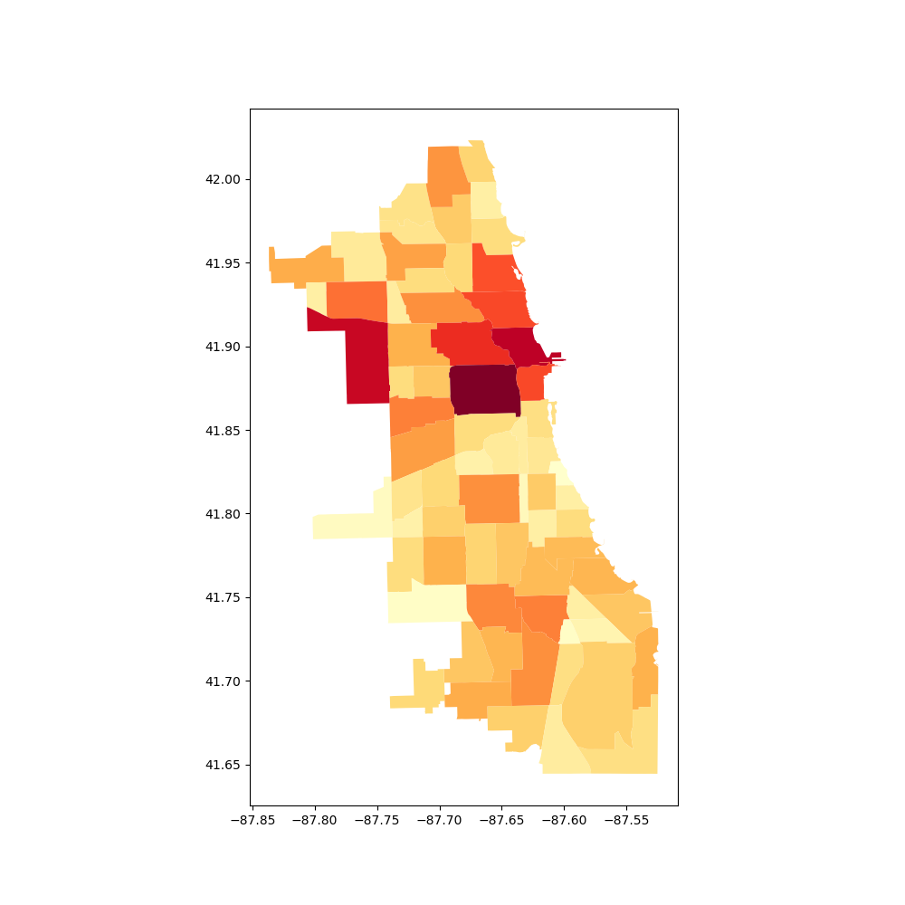
c. Visualize Stations (10 pts)
We wish to understand which community areas have bike stations and
how that affects trips. Using geopandas, generate a plot of the number
of stations per community area, This requires creating a new data frame
by aggregating the stations by community area. Then, use the
plot command to generate a choropleth map from the
GeoDataFrame. This is done by choosing a column to serve as the value in
the map and setting a colormap (cmap).
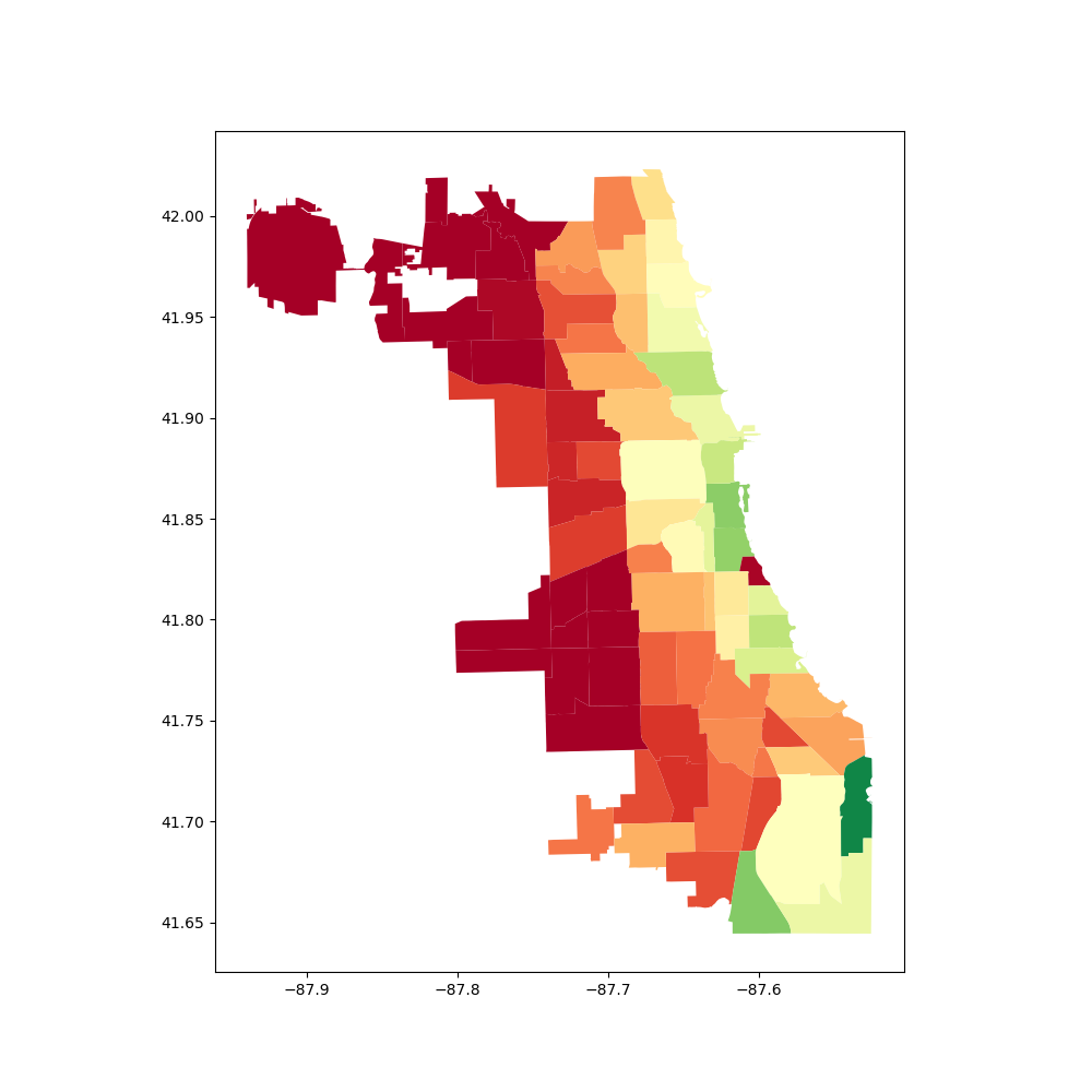
d. Visualize Trips (15 pts)
We are interested in the number of trips using pedal bikes versus
those using electric bikes (ebikes). Generate a plot showing the percent
difference between the trips by electric or pedal bikes starting or
ending in each community area. Use the filter of
rideable_type == "electric_bike" to differentiate between
ebikes and pedal bikes. Note that a trip starting in the LOOP and ending
in the NEAR WEST SIDE will add one to both of those
community areas. We need to calculate four aggrgations: the first for
all starting cas for pedal bikes, the second for all ending cas for
pedal bikes, the third for all starting cas for ebikes, and the fourth
for all ending cas for ebikes. Then combine the pedal and ebike counts
them into a single count. Finally, compute the percentage difference
between pedal bikes and ebikes per ca ((# pedal bikes - # ebikes)/#
ebikes). Then, merge with the cas, and plot using a
diverging colormap for the second visualization.
Hints:
- For the trips, aggregate by starting and ending community area separately, then add them
- All operations should assume that a count is zero
if it is not specified. Use pandas
.addand.subtractmethods withfill_valueto do this. - Merge with the community area geo data frame to plot them.
3. Trip Community Paths (55 pts)
We will use a graph database, neo4j, to analyze the community areas likely traversed by people riding between their start and end stations, separated by whether they traveled by ebike or pedal bike. This requires path-type queries over a graph of community areas connected by edges when they border each other. We will do this once for ebikes and then a second time for pedal bikes.
a. Bordering Areas (10 pts)
First, we need to determine a graph of community areas where an edge
indicates that the community areas border each other. To do this, we
will compute the spatial join of community areas with themselves. There
are a number of operations that can be used for a spatial join, but to
make sure that areas with common borders are joined, we will use
'intersects'. Make sure to get rid of pairs of the same
area and deduplicate those that are listed twice. There should be 197
pairs of intersecting (bordering) areas.
b. Graph Database Creation (20 pts)
To begin, we will create a new graph database and add a Local DBMS to neo4j. Do this in the neo4j desktop application by creating a new project and creating a Local DBMS associated with that project. You may wish to stop other databases from running, and then start the new DBMS you just created. If you click on the newly created DBMS, you will see the IP address and Bolt port; copy the bolt url. Back in Jupyter, we now wish to connect to this DBMS. Use the following code (potentially with a different url as copied) to connect with the password you created:
from neo4j import GraphDatabase
driver = GraphDatabase.driver("bolt://localhost:7687", auth=("divvy", "divvybikes"))
We also wish to define some helper functions to help us run queries with neo4j (based on functions by CJ Sullivan):
def run_query(query, parameters=None):
session = None
response = None
try:
session = driver.session()
response = list(session.run(query, parameters))
finally:
if session is not None:
session.close()
return response
def batch_query(query, df, batch_size=10000):
# query can return whatever
batch = 0
results = []
while batch * batch_size < len(df):
res = run_query(query, parameters={'rows': df.iloc[batch*batch_size:(batch+1)*batch_size].to_dict('records')})
batch += 1
results.extend(res)
info = {"total": len(results),
"batches": batch}
print(info)
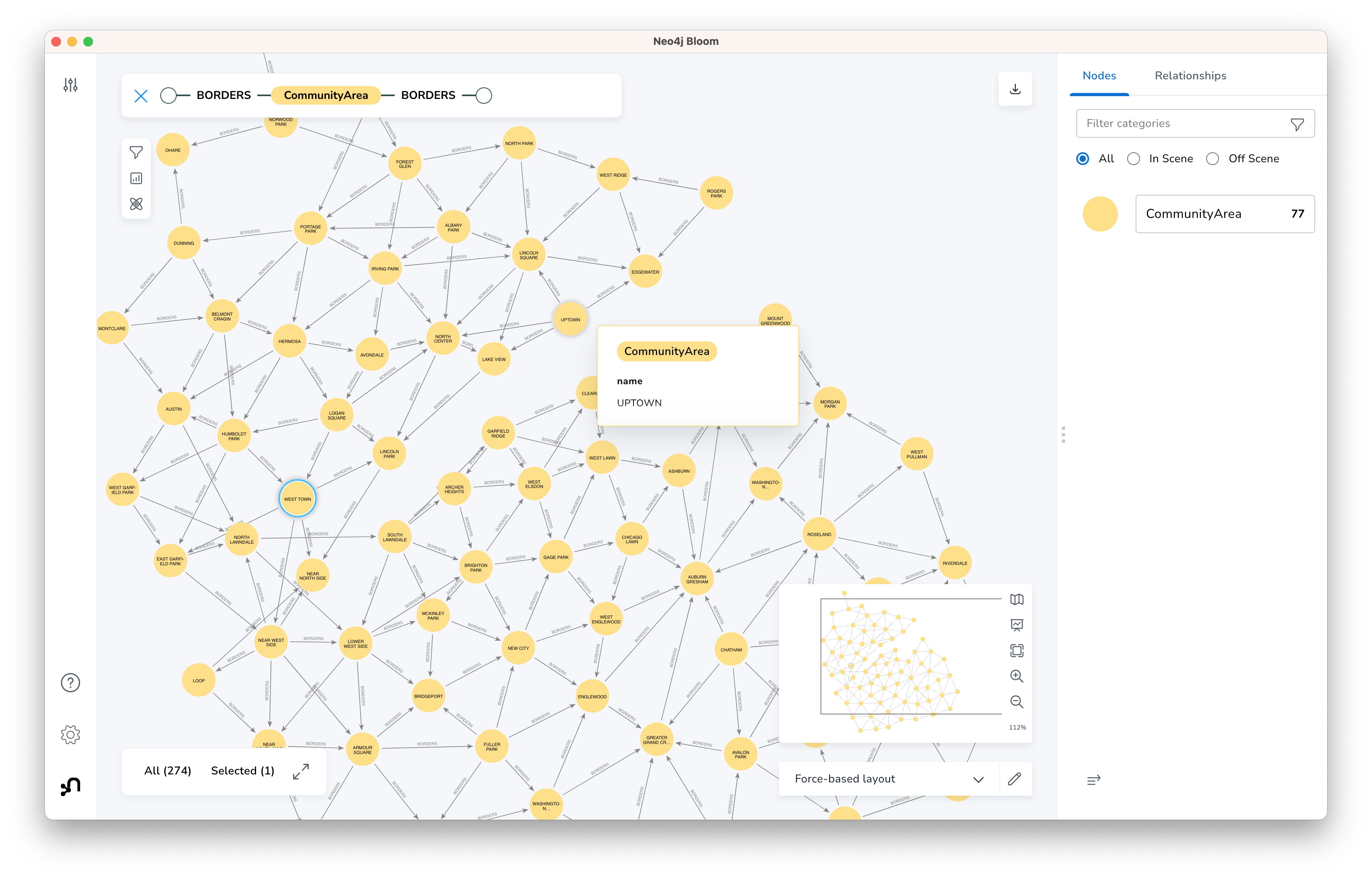
return resultsFrom this, we wish to create a graph database that consists of the
community areas and connections (relationships) to those community areas
they border. Take the original community areas data frame from Part 2,
and use it to create a node for each community area. Next, add
relationships (BORDERS) between community areas that border
each other (the 197 relationships from part a). After completing this,
you can go to the neo4j Bloom tool and visualize the
CommunityArea - BORDERS - CommunityArea graph which should
look something like the following:
Hints
- See this post for help on structuring the cypher queries to insert nodes and relationships.
- If your neo4j database has extra nodes or edges that were incorrectly created, you can start from scratch by “Remove”-ing the DBMS in the desktop application and then create a new Local DBMS. The port information should stay the same.
c. Compute Paths (20 pts)
Next, we wish to use the graph database to compute the paths for the
trips from the bike sharing data frame. We will do this for two filtered
data frames: (1) ebikes, and (2) pedal bikes; create these two data
frames first. We will only use those paths that start and end in
different community areas because the
shortestpath function doesn’t work with paths starting and
ending at the same node. Specifically, we wish to find a shortest path
from the community area that the trip starts in to the community area
that the trip ends in. (Note that this path is not unique.) From this
shortest path, we wish to know the community areas each path goes
through. From the results of the query, create a data frame with the
counts of the number of times a community area was part of a trip’s
path. Add the count of the trips that started and ended in the same
community to this dataframe. Make sure to do this for both ebikes and
pedal bikes, separately.
Hints
- Try doing this for a few trips (500,1000) first before running the entire trips data frame.
- Alternatively, group by start-end area pairs, compute paths for each pair, and multiply the results based on the number in each group.
- neo4j has a
shortestpathfunction that takes a path expression as its argument - In a path query,
(n1)-[:EDGE_TYPE]-(n2)is undirected while(n1)-[:EDGE_TYPE]->(n2)is directed. We don’t care which way the edge goes when analyzing a path. - You can hold onto the result by assigning using
= - Given a path as its argument, the
nodesfunction returns the list of nodes along that path. - You can use the
reducefunction to pull out only some of each node’s information (e.g. its area number). See this post for some ideas. - collections.Counter may be useful for keeping track of how many times an area was traversed.
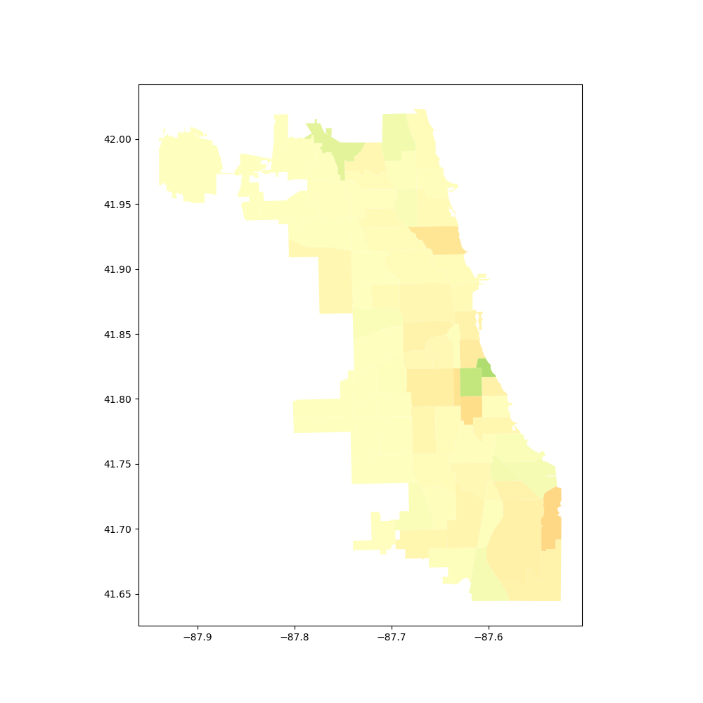
d. Visualization (5 pts)
Generate a plot showing the percent difference between the trips by
electric or pedal bikes passing through each community area. Use the
data frames from part c along with the same community areas geodataframe
(cas) we used for the visualizations in Part 2. This should
look similar to Part 2d. (If you want to see the difference, compute
that difference and plot it.)
4. [CS 680 Students Only] Temporal Analysis (40 pts)
Next, we wish to analyze when bikes are being used. Our interest in not simply how many trips there are, but how long cyclists keep their bikes. For example, if we want to know how many bikes were used at some point between 9am and 10am, this count would include a bike used from 8am-11am, a bike used from 9:30am-10:20am, and a bike used from 9:15am-9:40am. The count from 10-11am would include the first two bikes again.
a. Hourly Intervals (20 pts)
We wish to find when the rental interval overlaps with our defined
intervals; in our case, this will be every hour. Start by creating an
interval array for the rentals from the starting_at and
ending_at columns from the trips data using IntervalArray.from_arrays.
Note, however, that you will get an error because some of the trips have
timestamps out of order; drop those rows for this part of the analysis.
Now create an interval_range
that has hourly intervals from the beginning of July through the end of
the month. Compute the number of rental intervals that overlap with each
of the hourly intervals. (overlaps
helps here, but I think you will need to loop through the hourly
intervals, computing the overlaps for each one.) Create a new data frame
that has the index equal to the beginning of each hour interval, and
values equal to the number of overlapping rental intervals. From this
data frame, create a line plot that shows the number of rentals in use
during each hour. The first ten rows of the table are show below:
| num_rentals_active | |
|---|---|
| start_hour | |
| 2022-07-01 00:00:00 | 399 |
| 2022-07-01 01:00:00 | 328 |
| 2022-07-01 02:00:00 | 198 |
| 2022-07-01 03:00:00 | 140 |
| 2022-07-01 04:00:00 | 113 |
| 2022-07-01 05:00:00 | 237 |
| 2022-07-01 06:00:00 | 598 |
| 2022-07-01 07:00:00 | 978 |
| 2022-07-01 08:00:00 | 1173 |
| 2022-07-01 09:00:00 | 1119 |
Hints
- Make sure you have converted
starting_atandending_atto pandas timestamps - You can get the left or right side of an interval array using the eponymous properties.
- pandas has a
plotmethod, and specifying the correctkindparameter will produce a line plot.
b. Resampled (10 pts)
Using the final data frame from part a, downsample the data to days instead of hours, summing the total. Plot this downsampled data.
Hints
resampledoes most of the work.
c. Questions (10 pts)
In a markdown cell, answer the following three questions:
- In the plot from part a, what pattern do you notice when comparing weekdays to weekends? (Weekends are July 2-3, July 9-10, etc.)
- The plot in part b is not showing the number of bike rentals on each day; what is it actually showing?
- In the plot from part b, which day is anomalous? why?
Extra Credit
- CS 490 students may do Part 4 for extra credit
- Install modin and repeat the analyses (any or all parts) on the data from all twelve months of 2022.