Assignment 8
Goals
The goal of this assignment is to work with the data processing and visualization in Python.
Instructions
You will be doing your work in a Jupyter notebook for this
assignment. You may choose to work on this assignment on a hosted
environment (e.g. tiger)
or on your own local installation of Jupyter and Python. You should use
Python 3.14 for your work. To use tiger, use the credentials you
received. If you work remotely, make sure to download the .ipynb file to
turn in. If you choose to work locally, miniforge, Anaconda, pixi or uv are probably the easiest ways
to install and manage Python. If you work locally, you may launch
Jupyter Lab either from the Navigator application (anaconda) or via the
command-line as jupyter-lab or jupyter lab. If
working locally, you may need to install some packages for this
assignment: polars (and/or pandas), matplotlib, altair, and seaborn. Use
the Navigator application or the command line
conda install pandas polars matplotlib altair seaborn to
install all of them. These packages are already installed on tiger so
you do not need to install them.
In this assignment, we will be working with data and visualizing it. We will revisit the controlled medications data from Assignment 4, available from Brazil’s Agência Nacional de Vigilância Sanitária. However, instead of textual answers, we will create tables and visualizations to gain insight. We will use the data that is available at https://faculty.cs.niu.edu/~dakoop/cs503-2026sp/a4/brazil-medications.csv. Note that you do not need to download the data for because pandas can load the url directly as a csv file. There are a number of fields in the data. I have used translation software to understand the fields using the “Documentação e Dicionário de Dados SNGPC - Industrializados” file and have listed those we will be using here:
SG_UF_VENDA: Abbreviation of state where medication was dispensedNO_MUNICIPIO_VENDA: Municipality (city) where the medication was dispensedDS_PRINCIPIO_ATIVO: Active ingredient(s); if there is more than one, the ingredients are separated by the+characterQT_VENDIDA: The quantity of the medication sold (in boxes or bottles)SG_SEXO: The sex of the patient receiving the medication (1=male, 2=female)NU_IDADE: The age of the patient receiving the medication (can be in months or years, see next field)NU_UNIDADE_IDADE: The unit of the age (1=years, 2=months)
Due Date
The assignment is due at 11:59pm on Friday, May 1.
Submission
You should submit the completed notebook file required for this
assignment on Blackboard. The
filename of the notebook should be a8.ipynb.
Details
Please make sure to follow instructions to receive full credit. You must use the specified modules/libraries where indicated. Please document any shortcomings with your code. You may put the code for each part into one or more cells.
0. Name & Z-ID (5 pts)
The first cell of your notebook should be a markdown cell with a line for your name and a line for your Z-ID. If you wish to add other information (the assignment name, a description of the assignment), you may do so after these two lines.
1. Medication Statistics
First, we will use polars or pandas to compute statistics about the medications.
a. Largest Quantity Sold (5 pts)
Load the dataset. Note that this file is a CSV file, but it has a different separator (a semi-colon (‘;’)), In addition, you should recall that this file is encoded in latin-1, so you will need to specify the encoding when loading the file. Use the online documentation for pandas or polars to find the correct method and syntax for loading a CSV file with a different separator and encoding.
Next, compute the state,
municipality, active ingredient(s),
and quantity sold for the entry with the largest
quantity sold (QT_VENDIDA). Both pandas and polars have
methods to find the top-k (n-th largest) rows. In our case, we need
k/n=1. Both of these functions can use a subset of the
columns to order the rows. Use online documentation to find the correct
method name and syntax for the corresponding library.
Hints
- Both pandas and polars can use brackets to select a subset of columns, but the syntax is a bit different. In addition, polars supports the SQL-like select method.
b. Quantity of Medications by State and Municipality (10 pts)
Now, we wish to determine which municipalities dispensed the most
medications in the dataset. Use pandas or polars to compute the number
of entries for each state (the SG_UF_VENDA column) and
municipality (the SG_MUNICIPIO_VENDA column). This is an
instance of the split-apply-combine technique. You will need to group by
the state and municipality and then compute the sum of entries of the
QT_VENDIDA column for each combination. Sort the results by
the quantity in descending order so that the municipalities with the
most medications dispensed appear first.
Hints
2. Medications by Active Ingredient
In Assignment 4, you created a file that listed the active ingredients and the total number of times a medication with that active ingredient was dispensed. Now, use polars or pandas to recreate a dataframe that contains that information.
a. Exploded Active Ingredients (10 pts)
Recall that each ingredient in ingredients list
(DS_PRINCIPIO_ATIVO) is separated by a plus symbol (+), and
there will always be a space before and after the symbol. Use a string
method to split the ingredients into a list of ingredients. Then,
explode that column into multiple rows so that each row contains only
one active ingredient. The exploded column should have the same name
(DS_PRINCIPIO_ATIVO) at the end. You should now have 59_791
rows in the resulting dataframe.
Hints
- Use pandas
assignor polarswith_columnswhen updating a column. - When splitting using a delimiter string of length greater than one,
pandas will default to using a regular expression, which can lead to
unexpected results. You can disable this behavior by setting the
regexparameter toFalsein the string method. - Both pandas and polars have an
explodemethod that operates on a dataframe. polars has an explode method that operates on a column, but that will not preserve the other columns.
b. Bar Chart (10 pts)
Now, create a dataframe that aggregates the ingredients by counting the number of times each ingredient appears in the dataset. Then, find the top 10 most dispensed active ingredients. Now, using matplotlib, create a horizontal bar chart that shows the top 10 most dispensed active ingredients with the total count. Add a title and make sure the axes have meaningful labels. Sort the bars by the total.
Hints:
- Consider a group_by operation to compute the totals. This should be similar to Part 1b.
- See the matplotlib gallery for examples of bar charts.
c. Ingredient Counts by State and Sex (20 pts)
Now, using the dataframe from part a, we will count the total number
of times an ingredient was in a dispendsed medication by state and sex
(SG_SEXO). however, we will replace the values in
SG_SEXO with the strings “Male”, “Female”, and
“Unspecified” for the values 1, 2, and NaN/null, respectively. First,
filter out any rows where the active ingredient is null. Then, run a
group by on the three columns, using an aggregation that counts the
number of times each triple of values appears. Next, pivot the values
for SG_SEXO so that there is a column for each of the three
values, and sum these values to create a Total column. Here
is an snippet of the resulting dataframe:
| DS_PRINCIPIO_ATIVO | SG_UF_VENDA | Male | Unspecified | Female | Total |
|---|---|---|---|---|---|
| str | str | u32 | u32 | u32 | u32 |
| “AMOXICILINA TRI-HIDRATADA” | “SP” | 480 | 45 | 564 | 1089 |
| “AMOXICILINA TRI-HIDRATADA” | “MG” | 273 | 30 | 322 | 625 |
| “AMOXICILINA TRI-HIDRATADA” | “RS” | 167 | 8 | 174 | 349 |
| “AMOXICILINA TRI-HIDRATADA” | “RJ” | 127 | 12 | 129 | 268 |
| “AMOXICILINA TRI-HIDRATADA” | “PR” | 126 | 10 | 109 | 245 |
| … | … | … | … | … | … |
| “LINEZOLIDA” | “GO” | 0 | 0 | 1 | 1 |
| “FENOXIMETILPENICILINA POTÁSSIC… | “MA” | 1 | 0 | 0 | 1 |
| “FLUDROXICORTIDA” | “PB” | 0 | 0 | 1 | 1 |
| “CLORIDRATO DE ZIPRASIDONA MONO… | “SP” | 0 | 1 | 0 | 1 |
| “ZOPICLONA” | “PR” | 0 | 0 | 1 | 1 |
Hints:
- It is probably easiest to sum the values for the total, but you could also compute them independently (as in part b) and then use a join.
d. Grouped Bar Chart (15 pts)
Now, using seaborn (or matplotlib), create a horizontal grouped bar chart that shows the same top 10 most dispensed active ingredients (computed for part b), but now with the individual bars colored by sex (the three categories from part b).
Hints:
- You can create a similar dataframe to the one for part c, but keep track of the sums for each sex category (Male, Female, Unspecified). Then, consider an unpivot/melt operation to create a dataframe that has a count for each active ingredient and sex.
- You can also create such a dataframe directly from part a using a different group_by operation.
- With seaborn, you can create a stacked bar chart directly by encoding by hue in addition to the x and y encodings.
e. Stacked Bar Chart (10 pts)
Using altair and the same data as part d, create a horizontal stacked bar chart. You should not need to update your dataframe if you created it correctly for part d.
3. Maps
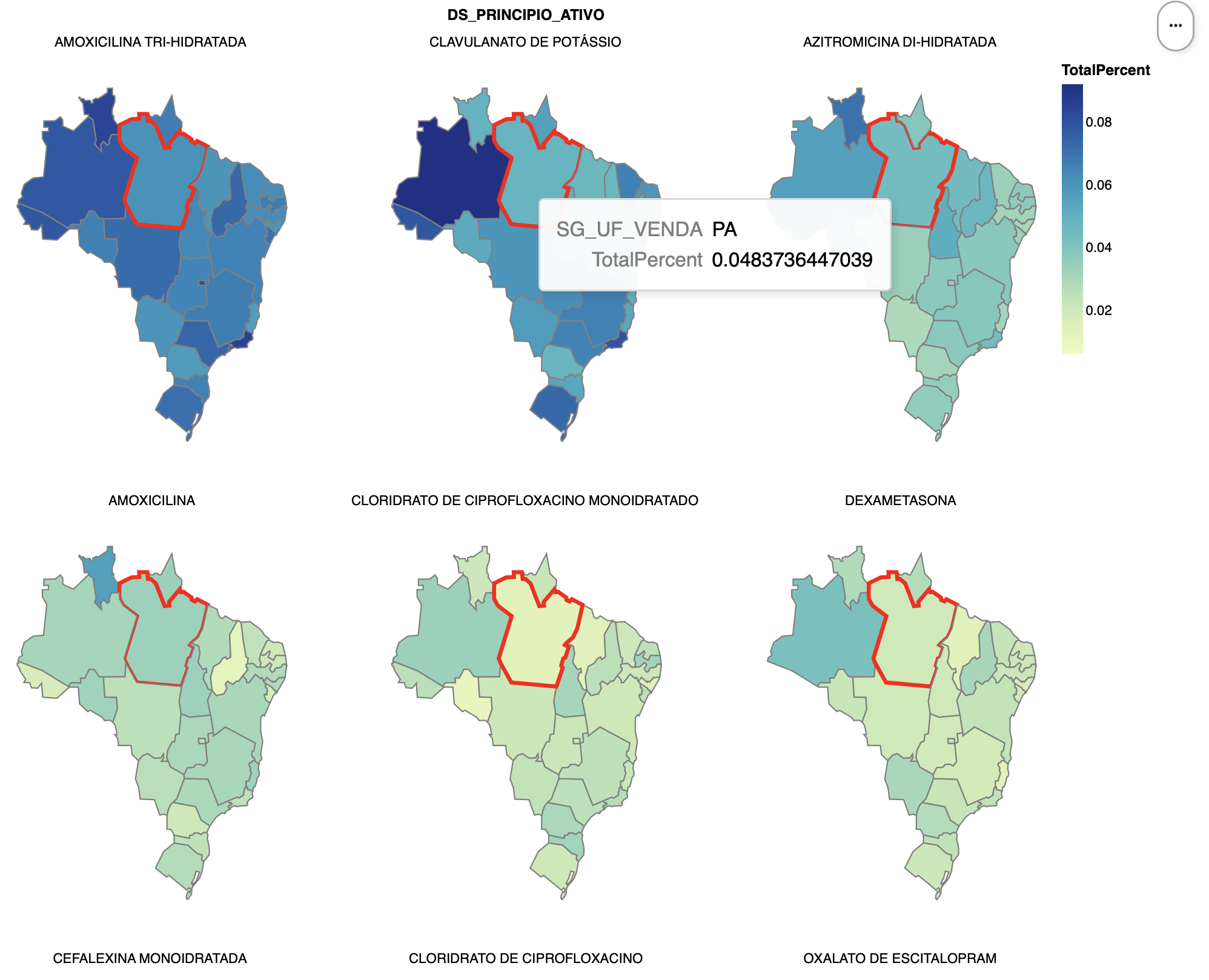
a. Ingredient Percentage Maps (15 pts)
Using altair, create six maps, one for each of the top six ingredients, that show, for each state, the percentage of dispensed ingredients that are of that type. (If we plot the raw totals, we will generally just set the states with highest populations.) You can use the same list from Part 2c/d, but now only the top six, but now we need a total over all ingredients for each state to compute the percentage. Compute the total number of ingredients per state, and then join this with the data from Part 2c/d, finally deriving a new percentage column.
For the visualization, this altair
example will be very useful as a reference, and make sure to cite it
if you adapt the code. We will use a topojson file that contains the
shapes of the Brazilian states, available at https://gist.githubusercontent.com/ruliana/1ccaaab05ea113b0dff3b22be3b4d637/raw/196c0332d38cb935cfca227d28f7cecfa70b412e/br-states.json.
Note that altair can load this file directly from the web, as is done in
the example. The field that we will use from the topojson file is
estados. For extra credit, sort the facets so that the most
used ingredients (by average percentage) appear first.
Hints
- Altair’s faceting is useful to apply the same plot for each group of data.
b. [CSCI 503 Only] Brushing (15 pts)
Add brushing to the set of six maps such that selecting a state when the mouse is over it highlights that same state in all of the other maps. Show this highlight by changing the stroke color and stroke width for the state.
Hints
- Consult altair’s documentation on selections
- You need to make sure the selection resolves according to the correct fields
- Both stroke color and width can be set using an
alt.whenstatement
Extra Credit
- [15 pts] CSCI 490 students may complete Part 3b.
- [5 pts] Sort the maps by the average percentage in Part 3a.
- [5 pts] Use altair to draw the plots in Parts 2b and/or 2d.
- [10 pts] Use matplotlib to draw the plot in Part 2d or 2e.