Assignment 8
Goals
The goal of this assignment is to work with the data processing and visualization in Python.
Instructions
You will be doing your work in a Jupyter notebook for this
assignment. You may choose to work on this assignment on a hosted
environment (e.g. tiger)
or on your own local installation of Jupyter and Python. You should use
Python 3.12 or higher for your work (although >= 3.9 is probably ok).
To use tiger, use the credentials you received. If you work remotely,
make sure to download the .ipynb file to turn in. If you choose to work
locally, Anaconda is the
easiest way to install and manage Python. If you work locally, you may
launch Jupyter Lab either from the Navigator application or via the
command-line as jupyter lab. If working locally, you may
need to install some packages for this assignment: pandas | polars,
matplotlib, and altair. Use the Navigator application or the command
line conda install pandas polars matplotlib altair to
install all of them. These packages are already installed on tiger so
you do not need to install them.
In this assignment, we will be working with data and visualizing it. We will revisit the port of entry data from Assignment 5, available from the United States Department of Transportation. However, instead of textual answers, we will create tables and visualizations to gain insight. We will use the same data that is available at https://gist.githubusercontent.com/dakoop/2d80cefa399f1926a9a6d16f7d5d8757/raw/d137113184043b465c27f259e5b86f931fb133b2/border-crossing.json (backup link). Note that you do not need to download the data for because pandas can load the url directly as a json file. This data has the following columns:
Port Name: a name for the port, often associated with its locationState: the state the port is located inPort Code: a unique numeric identifier for the portBorder: the country whose border the port is for (Canada or Mexico)Date: the month and year the data when the data was collected, as a stringMeasure: the type of conveyance/container/person being countedValue: the value of the measure for the specified month
Due Date
The assignment is due at 11:59pm on Friday, May 2.
Submission
You should submit the completed notebook file required for this
assignment on Blackboard. The
filename of the notebook should be a8.ipynb.
Details
Please make sure to follow instructions to receive full credit. Please document any shortcomings with your code. You may put the code for each part into one or more cells.
0. Name & Z-ID (5 pts)
The first cell of your notebook should be a markdown cell with a line for your name and a line for your Z-ID. If you wish to add other information (the assignment name, a description of the assignment), you may do so after these two lines.
1. Ports of Entry Statistics (20 pts)
First, we will use pandas or polars to compute statistics about the ports of entry.
a. Most Bus Passengers (10 pts)
Load the dataset. Note that it is easier to load this with pandas
because (a) it can load from the URL directly, and (b) it will
automatically recognize and convert the dates (“Dec 2023”) to date
objects. If you load via polars, you will first need to download the
data (e.g. using requests) and then convert the Date column
to a polars date.
You may do this for extra credit (5 pts). If you wish to use polars for
the rest of the assignment, you can also load the DataFrame using pandas
and pass it to the polars constructor
(df = pl.DataFrame(pandas_df)).
Next, compute the month, port of
entry, and number of passengers when the
most Bus Passengers crossed the border. In this case,
the month is the Date column of the dataset which includes
a month and a year (so you do not need to aggregate
anything for this part). Both pandas and polars have methods to find the
top-k (n-th largest) rows. In our case, we need k/n=1. Both of these
functions can use a subset of the columns to order the
rows. Use online documentation to find the correct method name and
syntax for the corresponding library.
Hints
- In polars, you can filter the data using the
filtermethod while in pandas, you can use either the bracket (mask) syntax or thequerymethod.
b. Number of Ports per State (10 pts)
Redo Part 3b of Assignment 3 with pandas or polars–count the number of ports for each state. Make sure that you count each unique port only once. You solution should have the states and counts.
Hints
2. Number of Crossings over Time
Next, let’s use visualization to examine trends in border crossings over time. Use matplotlib for this section.
a. Line Chart (15 pts)
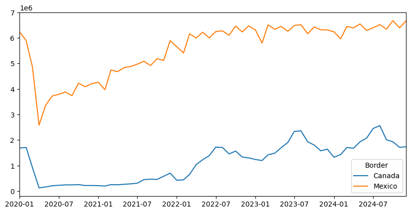
Using matplotlib directly or via pandas, create a line chart visualization with two lines showing “Personal Vehicles” crossing over the months, one for crossings from Canada and the other from Mexico. You will need to use split-apply-combine again, but this time to sum the crossings for all of the ports of entry for each month. The lines should be different colors, and include a legend that indicates the values being shown by each line.
Hints:
- Using pandas, you can accomplish this plot in very few lines of code, but it can take some time and experimenting to find the correct set of calls.
- Since polars does not have a matplotlib backend, it will be easier to construct the lines via the pyplot API.
- The
labelparameter can be useful when drawing multiple lines and creating the legend.
b. Stacked Bar Chart (20 pts)
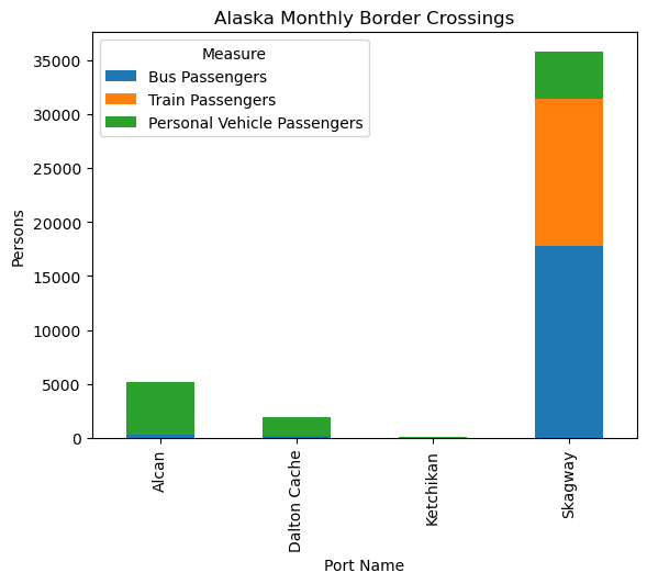
Using matplotlib directly or via pandas’ plotting routines, create a visualization showing the average number of people crossing monthly for the three ports of entry in the state of Alaska using different modes of transportation. (Note that Ketchikan sees very few crossings so it will be almost invisible.) The modes we wish to examine are: Train Passengers, Bus Passengers, and Personal Vehicle Passengers. Consider filtering the data to these ports and measures and then grouping by port, computing the mean over the months.
If you use pandas, then after the groupby you can transform the data frame so that its rows are ports and its columns are the three modes of transportation. That data frame can be used directly by the pandas plot method. Display a legend. (You may also take an approach like polars below but it will be more complicated because pandas does not have an over modifier.)
If you use polars, the easiest way to draw a stacked bar chart is to
compute the bars in visible order and draw them on top of each other.
(This is a bit more complicated than pandas so you may also just use the
to_pandas method for this part and use pandas.) One way to
determine the heights of each of the bars is to use the cumulative
sum along with the over
modifier. This cumulative sum will be the full height (from baseline) of
the bar. Then make three different calls (setting the label) for each
mode of transportation. Your loop body should be a single call to
pyplot.
Hints:
- You are grouping by two columns.
- If you are using pandas,
unstackwill be useful if you set up your data correctly. Note that unstack can take a parameter that indicates the level of the index.
3. Port of Entry Comparison
Given the differences in vehicle crossings for different ports, we are interested to compare some of the ports that have the highest traffic over the time period from 2019 to present. Use altair for this part of the assignment.
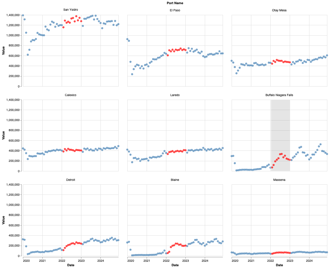
a. Port of Entry Dot Plots (15 pts)
Using altair, create nine dot plots showing the
number of personal vehicles crossing each of the
borders identified by the port codes
[901, 3801, 3004, 704, 2504, 2402, 2506, 2503, 2304] for
the time from 2019-01-01 through the most recent data. This altair
example will be very useful as a reference, but make sure to cite it
if you adapt the code. There should be a dot plot for each of nine
ports; this is an instance of the small multiples visualization
technique. For extra credit, sort the facets so that the most heavily
trafficked ports (by average monthly vehicles) appear first.
Hints
- Make sure to filter the data to only keep the specified ports for the specified time.
- pandas will convert a string to a date if you want to compare dates, but polars expects a date object when doing the comparison.
- Altair’s faceting is useful to apply the same plot for each group of data.
b. [CSCI 503 Only] Brushing (15 pts)
Add interval brushing to the set of got plots such that a range of dots in one plot highlights the dots corresponding to the same date range in other plots. Show this highlight by changing the selected marks’ color.
Hints
- Consult altair’s documentation on selections
- You need to make sure the selection uses the correct encoding, empty, and resolve settings.
- The fill color can be set using an
alt.condition.
Extra Credit
- [5 pts] Load the data using polars and convert the date column to a
pl.Datetype - [15 pts] CSCI 490 students may complete Part 3b.
- [5 pts] Sort the dot plots by the average traffic in Part 3a.
- [10 pts] Use altair to draw the plots in Part 2.