Assignment 8

Goals

The goal of this assignment is to work with the data processing and visualization in Python.

Instructions

You will be doing your work in a Jupyter notebook for this assignment. You may choose to work on this assignment on a hosted environment (e.g. tiger) or on your own local installation of Jupyter and Python. You should use Python 3.13 for your work. (Older versions may work, but your code will be checked with Python 3.13.) To use tiger, use the credentials you received. If you work remotely, make sure to download the .ipynb file to turn in. If you choose to work locally, Anaconda, miniforge, or uv are probably the easiest ways to install and manage Python. You can start JupyterLab either from the Navigator application (anaconda) or via the command-line as jupyter-lab or jupyter lab. If you are not using tiger, you may need to install some packages for this assignment: polars, pandas, matplotlib, altair, and seaborn will be useful. If you are using conda on your own machine, use the command line conda install polars pandas matplotlib altair seaborn to install them.

In this assignment, we will be working with data and visualizing it. We will revisit the Pokémon dataset, but instead of textual summaries, we will create tables and visualizations to gain insight. You may use either polars or pandas for data manipulation, but you must use the specified visualization library for those parts.

Due Date

The assignment is due at 11:59pm on Friday, December 5.

Submission

You should submit the completed notebook file required for this assignment on Blackboard. The filename of the notebook should be a8.ipynb.

Details

Please make sure to follow instructions to receive full credit. Please document any shortcomings with your code. You may put the code for each part into one or more cells. You may use either polars or pandas for data manipulation, but you must use the specified visualization library for those parts. CSCI 490 students do not need to complete Part 2e, but may do so for extra credit. CSCI 503 students must complete all parts.

0. Name & Z-ID (5 pts)

The first cell of your notebook should be a markdown cell with a line for your name and a line for your Z-ID. If you wish to add other information (the assignment name, a description of the assignment), you may do so after these two lines.

1. Maximum Combat Power

We will compute the maximum combat power (MaxCP) method using dataframes, and find the Pokémon with the greatest MaxCP in each generation. You may use either polars or pandas (your choice) for data manipulation. Download and load the pokemon.json file as a pandas data frame; it is unchanged from Assignment 5 so if you still have it, you can use that same file.

a. Compute Combat Power (15 pts)

Again, the maximum combat power can be computed via information here for level 40 as:

Attack = 2 * round(attack^0.5 * sp_attack^0.5 + speed^0.5)
Defense = 2 * round(defense^0.5 * sp_defense^0.5 + speed^0.5)
Stamina = 2 * hp
MaxCP = (Attack + 15) * (Defense + 15)^0.5 * (Stamina + 15)^0.5 * 0.7903001^2 / 10

We wish to create a dataframe with a new column named max_cp that stores this computed value. Do this without loops. Remember that we can do computations with series (columns) in dataframes.

Hints:
  • Remember the with_columns and assign methods for polars and pandas, respectively.

b. Maximum Combat Power by Generation (10 pts)

Now, find the Pokémon with the greatest maximum combat power in each of the eight generations. Output the name of the pokemon along with it’s max_cp value.

Hints:
  • Instead of using a groupby, it may be easier to sort in decreasing order by max_cp, and find a way to locate the first of each generation.
  • In polars, the over modifier may be useful.
  • pl.unique and pd.drop_duplicates have a subset parameter to only consider duplicates based on a particular column.

2. Primary Types and Attack, Defense, & Speed

Now, let’s examine the breakdown of primary types and generations, in addition to attack, defense, and speed statistics. Again, you may use either polars or pandas for data manipulation.

Now, let’s group by the primary type, and examine the average values of each of attack, defense, and speed.

a Mean Values by Primary Type (10 pts)

Create a dataframe that groups by the primary type and computes the mean attack, defense, and speed for each primary type.

Hints
  • Remember there are shortcuts for aggregating multiple columns with the same aggregation function in both polars and pandas.

b. Melt/Unpivot the Dataframe (5 pts)

Next, melt/unpivot this data to put it into a long format with three columns: primary_type, variable, and value, where variable is one of attack, defense, or speed, and value is the corresponding mean value.

Hints
  • Check the documentation if you do not remember which columns to identify in the melt/unpivot operation.

c. Bar Chart (10 pts)

Using seaborn, matplotlib, or via pandas’ plotting routines, create a grouped bar chart that shows the mean attack, defense, and speed for each primary type. Set the figure size wider to improve the visualization. Include a legend and make sure the axes are properly labeled.

With either pandas or polars, seaborn’s barplot is the most straightforward solution. Use the penguins grouped by sex as a guide.

If you are using pandas, you can use its built-in plot method (which uses matplotlib) to create the grouped bar chart, but you will want to go back to the unmelted version of the dataset. Make sure the rows are primary types and the columns are the three statistics.

If you use polars, you can use to_pandas to convert to pandas and use its plot facilities as described above, but you can do this directly via matplotlib, although this is much more involved. You will receive extra credit for doing it this way. The easiest way to draw a grouped bar chart is to draw three different bar charts, one for each statistic, but with proper offsets for the x positions. Your loop body should be a call to pyplot. The offset calculation is a bit tricky so here is a starting structure for how this works:

import matplotlib.pyplot as plt

# convert the category to a number for offsets
df = df.with_columns(
    pl.col("primary_type").cast(pl.Categorical).cast(pl.UInt32).alias("primary_num")
)
for i, col in enumerate(["attack", "defense", "speed"]):
    df_offset = df.with_columns((pl.col("primary_num") * 2 + (i - 1) / 2).alias("offset"))
    plt.bar(
        ...,
        data=df_offset
    )
# other calls for legend, labels
Example Solution for Part 2a
Hints:
  • You can use the width property to control the amount of whitespace between bars.

d. Scatterplot (15 pts)

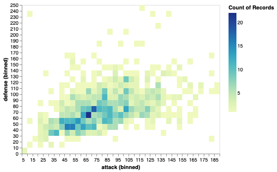
From the bar chart, we think there may be a negative correlation between attack and defense averages versus speed averages. Using the grouped data from Part a, and then add the attack and defense means together to create a new column. Using matplotlib directly (seaborn and pandas are not allowed), plot this new column versus the speed column. Label the axes appropriately. You should see one significant outlier with respect to the negative correlation. Using values from the visualization, write a filter operation to identify the primary type of this outlier. (You should be able to estimate the values from the plot axes to construct a filter.)

Hints:
  • The data kwarg version of the matplotlib plotting functions may be easiest to use with dataframes.
  • Remember the with_columns and assign methods for polars and pandas, respectively.

e. [CS503 Only] Scatter Matrix (15 pts)

Now, let’s use all three attributes and use altair to create a scatter matrix. A scatter matrix is a bunch of scatterplots, one for each pair of variables. Begin by creating a scatterplot that compares just attack and speed. Once you have this, change the x and y values to use the repeat capabilities of altair, and set the repeat over the speed, attack, and defense attributes.

Hints:

3. Attack-Defense Distribution

a. Bubble Chart (15 pts)

Using altair, create a bubble chart visualization that shows Pokémon positioned by attack and defense, sized by speed, and colored by generation. Make sure you aren’t biasing the visualization toward showing more from the later generations; this occurs by having later generations plotted on top of the older generations.

Example Solution for Part 3a

Hints:
  • Consider the size and color encodings to create a bubble chart
  • To obtain a different colormap for the generation, consider tagging it with a different type
  • Investigate the sample method for polars and pandas to reorder data items

b. Binned Scatterplot (15 pts)

Since Part b led to major overdraw problems (points occluding other points), we will create a binned scatterplot that shows the count of the number of Pokémon in a particular attack/defense bin. This will help us better see the distribution of Pokémon according to attack and defense measures. Use 1200 bins (40x30) or some other reasonable number that shows the trend.

Example Solution for Part 3b

Hints:
  • You can do aggregations in a field definition
  • Bin transforms are very useful here. It is likely easier than trying to do this using the dataframes.

Extra Credit

  • CSCI 490 students may complete Part 2e for extra credit. (15 pts)
  • Use a polars dataframe and matplotlib directly to create the grouped bar chart in Part 2c. (10 pts)
  • Add a brushing interaction to the scatter matrix in Part 2e that highlights the selected points in all scatterplots. (10 pts)