Assignment 8
Goals
The goal of this assignment is to work with the data processing and visualization in Python.
Instructions
You will be doing your work in Python for this assignment. You may
choose to work on this assignment on a hosted environment (e.g. tiger) or on your own local
installation of Jupyter and Python. You should use Python 3.12 for your
work, but other recent versions should also work. To use tiger, use the
credentials you received. If you choose to work locally, Anaconda or miniforge are
probably the easiest ways to install and manage Python. If you work
locally, you may need to install some packages in addition to those from
previous assignments for this assignment: matplotlib and altair. Use the
Navigator application or the command line
conda install matplotlib altair to install them.
In this assignment, we will be working with data and visualizing it. We will revisit the Utility Energy Registry dataset, but instead of textual summaries, we will create tables and visualizations to gain insight. The data has been pre-processed and is available as a compressed csv file at http://faculty.cs.niu.edu/~dakoop/cs503-2024sp/a8/ny-county-energy.csv.gz. Note that you do not need to download or uncompress the data because pandas can load the url directly as a csv file. This data has the following fields:
county_name: the name of the countyyear: the year the data was collectedmonth: the month the data was collecteddata_class: electricity or natural_gasdata_field: a tag for the field measureddata_field_display_name: the field measured in human-readable form (e.g. “Total Consumption (T)”)unit: the unit of measurement (MWh, Therms)value: the value of the measurementnumber_of_accounts: the number of accounts included in the measurement
Due Date
The assignment is due at 11:59pm on Thursday, May 2.
Submission
You should submit the completed notebook file required for this
assignment on Blackboard. The
filename of the notebook should be a8.ipynb.
Details
Please make sure to follow instructions to receive full credit. Because you will be writing classes and adding to them, you do not need to separate each part of the assignment. Please document any shortcomings with your code. You may put the code for each part into one or more cells.
0. Name & Z-ID (5 pts)
The first cell of your notebook should be a markdown cell with a line for your name and a line for your Z-ID. If you wish to add other information (the assignment name, a description of the assignment), you may do so after these two lines.
1. Maximum Natural Gas Use (25 pts)
First, we will use pandas to compute statistics to find the New York counties with large natural gas usage.
a. Maximum County Total in a Month (10 pts)
Load the dataset. Compute the county and year+month which used the
most natural gas (the data field display name is
"Total Consumption (T)" while the data_field
is "6_nat_consumption"). In your notebook, be clear about
which county, year, and month had the highest natural gas use.
Hints
- You can use pandas to load the data directly from the url above without downloading it.
- You can filter the data by two criteria by using the
&operator, but remember to use parentheses. - Sorting may work better than a statistical function like
max.
b. Maximum Per-Account Usage County in Dataset (15 pts)
Next, compute the county that used the most natural
gas per account. Again, we use the
Total Consumption (T) ("6_nat_consumption")
category, but need to add up both the usage and number of accounts over
all the months. Then, we need to compute a derived column by dividing
the usage by the number of accounts. Do this all
without loops. The answer will be a different county
than in part a. Again, make sure to state the answer in your
notebook.
Hints
- You will need to use
groupbyand an aggregation operation to compute the totals. - You can assign to a new column like you would assign to a
dictionary, or consider using the
assignmethod.
2. Total Electricity and Natural Gas Usage over Time
Next, let’s use visualization to examine trends in total electricity and natural gas use over time. We will use matplotlib (via pandas) for this.
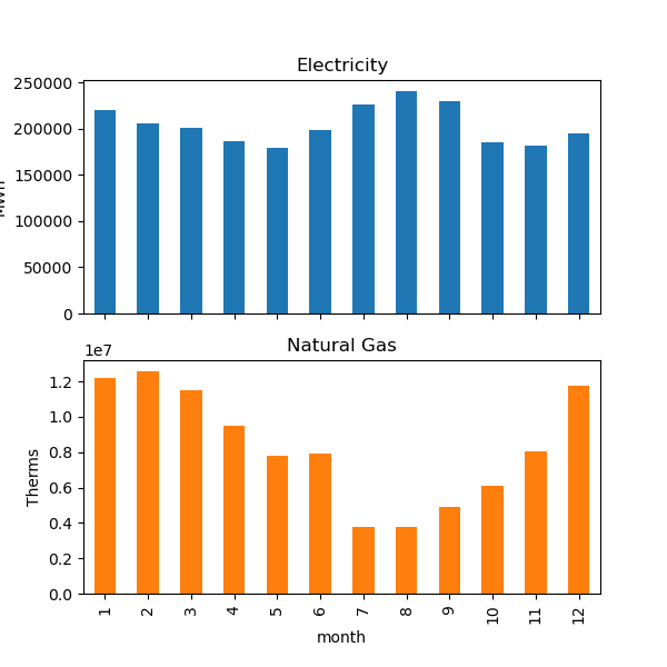
a. Bar Charts (15 pts)
Using matplotlib directly or via pandas’ plotting routines, create a
visualization with two subplots, one for electricity and one for natural
gas. Each plot should show a bar chart of the state’s
average use (over all years) for each month for the
corresponding energy class. You can extract only the total consumption
by querying for the Total Consumption (T)
data_field_display_name. (The individual data_fields are
3_nat_consumption (electricity) and
6_nat_consumption (natural gas).) If you would like pandas
to plot this automatically, use the subplots=True option,
but you will need your data to look correct first. Specifically, rows
should be months and columns should be the type of energy (electricity
and natural_gas). Note that you should title the plots according to the
type of energy. You do not need to label the axes, but will receive
extra credit if you.
Hints:
- Here, a groupby and aggregation will again work, but the columns used to group will be different than Part 1b.
unstackmay be useful if you set up your data correctly. Note that unstack can take a parameter that indicates the level of the index- Turn off the legend as it is unnecessary. See the documentation for information about this.
b. Line Charts (15 pts)
Again, using matplotlib directly or via pandas, create a
visualization with two subplots for energy and natural gas, but this
time showing the total per month as line charts. Here,
we need to manipulate the data first to get meaningful dates first. You
can use pandas’ to_datetime
method to accomplish this, but you will need to pass it either a data
frame that has the columns year, month, and day, or a series of string
values that look like dates (e.g. ‘2023-01’). (If you go the first
route, assign
will help add a day column.). Then, similar groupby-aggregation steps
will work as in Part 2a. You should again title the plots according to
the type of energy. You do not need to label the axes, but will receive
extra credit if you do.
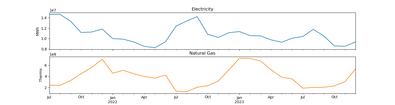
Hints:
- The
titleparameter is useful for labeling subplots in pandas - Using pandas, you can accomplish this plot in very few lines of code, but it can take some time and experimenting to find the correct set of calls.
3. Counties By Month
Given the interesting patterns between electricity and natural gas use over the seasons, we are interested in seeing how this plays out in different counties by month. We will use altair to explore this.
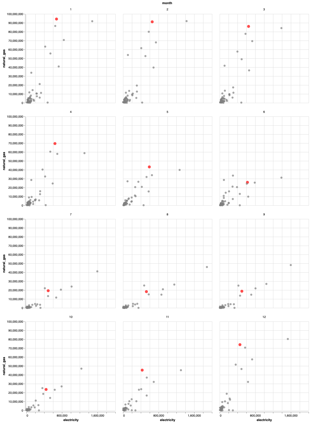
a. Monthly Scatterplots (15 pts)
Using altair, create a set of twelve scatterplots for 2023 that show
electricity versus natural gas use. Use the altair’s facet
capabilities to draw a scatterplot for each month. Add a tooltip that
shows the county name so that moving the mouse over the point shows its
name. Draw the scatterplots in a 4x3 layout.
Hints:
facethas an option for the number of columns to use- One of altair’s encodings is the tooltip
b. [CSCI 503 Only] Scatterplot Brushing (15 pts)
Now add brushing to the set of twelve scatterplots such that selecting a point corresponding to a particular county in one of the scatterplots highlights that same county in all of the other months. Show this highlight by both changing the color and the size of the point.
Hints
- Consult altair’s documentation on selections
- You need to make sure the selection resolves according to the correct fields
- Both color and size can be set using a condition.
Extra Credit
- [15 pts] CSCI 490 students may complete Part 3b.
- [5 pts] Add the x- and y-axis labels for Part 2a.
- [10 pts] Use altair to draw the plots in Part 2.