Assignment 8
Goals
The goal of this assignment is to work with the data processing and visualization in Python.
Instructions
You will be doing your work in Python for this assignment. You may
choose to work on this assignment on a hosted environment (e.g. tiger) or on your own local
installation of Jupyter and Python. You should use Python 3.9 or higher
for your work. To use tiger, use the credentials you received. If you
work remotely, make sure to download the .py files to turn in. If you
choose to work locally, Anaconda is the easiest way
to install and manage Python. If you work locally, you may launch
Jupyter Lab either from the Navigator application or via the
command-line as jupyter lab. You may need to install some
packages for this assignment: pandas, matplotlib, and altair. Use the
Navigator application or the command line
conda install pandas polars matplotlib altair to install
them.
In this assignment, we will be working with data and visualizing it. We will revisit the employment data from Assignment 7, available from the Illinois Department of Employment Security. However, instead of textual summaries, we will create tables and visualizations to gain insight. The data has been pre-processed and is available as a compressed csv file at https://faculty.cs.niu.edu/~dakoop/cs503-2024fa/a8/illinois-employment.csv.gz. Note that you do not need to download or uncompress the data because polars or pandas can load the url directly as a csv file. This data has the following fields:
COUNTY: the name of the county (with “COUNTY” appended)FIPS: a numeric code identifying the countyYEAR: the year the data was collectedLABOR_FORCE: the number of people in the labor forceEMPLOYED: the number of people employedUNEMPLOYED_NUMBER: the number of people unemployedRATE: the unemployment rate
Due Date
The assignment is due at 11:59pm on Friday, December 6.
Submission
You should submit the completed notebook file required for this
assignment on Blackboard. The
filename of the notebook should be a8.ipynb.
Details
Please make sure to follow instructions to receive full credit. Please document any shortcomings with your code. You may put the code for each part into one or more cells.
0. Name & Z-ID (5 pts)
The first cell of your notebook should be a markdown cell with a line for your name and a line for your Z-ID. If you wish to add other information (the assignment name, a description of the assignment), you may do so after these two lines.
1. Unemployment Rates (25 pts)
First, we will use dataframes to compute statistics to find the Illinois counties with high unemployment.
a. Highest Unemployment Rate (2010+) (10 pts)
Load the dataset. Remember to make sure all county names are in the same casing. Compute the county and year which had the highest unemployment rate since 2010 (including that year). In your notebook, be clear about which county and year had the highest unemployment.
Hints
- You can use polars or pandas to load the data directly from the url above without downloading it.
- Remember the different filtering syntax styles for the libraries.
- Statistical functions give the maximum value, but
arg/idxversions of those functions give the index.
b. Lowest Average Unemployment Rate in the 2000s (15 pts)
Next, compute the county that had the lowest average unemployment rate in the 2000s (that is during the years 2000 through 2009, inclusive). To do this, first compute the average unemployment rates (think split-apply-combine), and then find the minimum entry using a similar strategy to part a. Do this all without loops. Again, make sure to state the answer in your notebook.
Hints
2. Employment Status over Time
Next, let’s use visualization to examine trends in Illinois employment over time. We will use matplotlib for this.
a. Line Chart (15 pts)
Using matplotlib directly (with polars or pandas) or via pandas’
plotting routines, create a line chart visualization with the
unemployment rate (RATE) over the years for the subset of
counties around DeKalb we examined in Assignment 7. Those counties are:
DEKALB, KANE, BOONE,
MCHENRY, WINNEBAGO, OGLE,
LEE, and KENDALL. Consider filtering the data
to these counties, and then pivoting the county before plotting all of
the counties. The lines should be different colors, and include a legend
that indicates the counties being shown by each line.

Hints:
- Using pandas, if you transform the data correctly, the plotting code from pandas should be straightforward.
- Using polars, you will likely need to loop and create multiple line
charts that are plotted on top of each other. Use the
data=versions of the plot calls. (Note that for line plots, you cannot use keyword arguments forxandybut can pass them as arguments by position.)
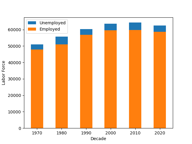
b. Stacked Bar Chart (15 pts)
First, group the data by decade and calculate the
average LABOR_FORCE and EMPLOYMENT. You can
create a new column for the decade by calculating it from the year. For
example, the decade for 1986 is 1980, and for 2011, it is 2010. There is
a mathematical way to compute this (again, do not use loops). Now, using
matplotlib directly or via pandas’ plotting routines, create a bar plot
that shows each decade with the average LABOR FORCE and
EMPLOYMENT, but with the EMPLOYMENT bar
in front of the LABOR_FORCE (effectively
showing the employed and unemployed partition). You can do this by
plotting two bar charts on top of each other. Remember to label
axes.
Hints:
- Consider using the integer division operator.
3. Maps
Given the differences in rates across different counties, we are interested to see if there are any spatial relationships between the county unemployment rates.
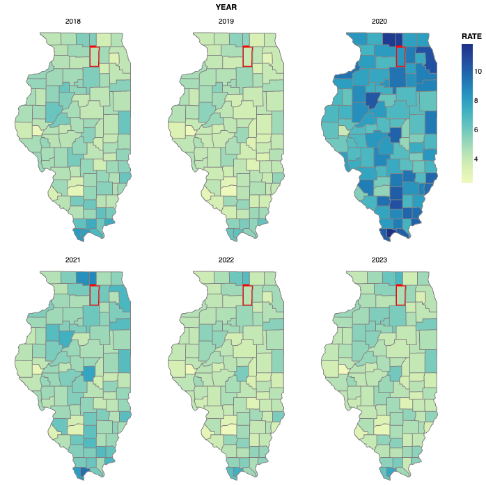
a. County Locations (20 pts)
Using altair, create a set of six maps showing the unemployment rate
for each county for each of the years from 2018 through 2023. This altair
example will be very useful as a reference, but make sure to cite it
if you adapt the code. We will use a topojson file that contains the
shapes of the counties, available at https://raw.githubusercontent.com/subyfly/topojson/refs/heads/master/us-states/IL-17-illinois-counties.json.
Note that altair can load this file directly from the web, as is done in
the example. The field that we will use from the topojson file is
cb_2015_illinois_county_20m.
The field we will use to match the counties from the topojson file to
our data frame (using LookupData) is the FIPS code.
However, in the topojson file, this is specified in the
properties.COUNTYFP property as a string
with leading zeros (e.g. "003"). Thus, we need to create a
column in our data frame from the FIPS column that matches
this format. Convert the column to a string and then use pandas string
methods to add zeroes to right-justify the data. Filter the data to only
include the years from 2018 through 2023, and then create an altair
visualization that shows the unemployment rate for each county in a 2x3
layout. Set the width and height properties so the width is narrower
than the height. Use the mercator projection. You will need
to facet the visualization so that there is a map for
each year. See Part b for an example of what this would
look like (for Part a, you do not need the red highlight).
Hints
- The lookup must be done from employment data to topojson because it would only match one year in the reverse.
- The
astype(pandas) andcast(polars) methods are useful for transforming the type of a column - Consider one of the polars’
pad*or pandas*juststring methods for transforming strings to add the leading zeros.
b. [CSCI 503 Only] Brushing (15 pts)
Add brushing to the set of six maps such that selecting a county when the mouse is over it highlights that same county in all of the other maps. Show this highlight by changing the stroke color and width of the county.
Hints
- Consult altair’s documentation on selections
- You need to make sure the selection resolves according to the correct fields
- Both stroke color and width can be set using an
alt.whenstatement
Extra Credit
- [15 pts] CSCI 490 students may complete Part 3b.
- [10 pts] Sort the bars in Part 2b.
- [10 pts] Use altair to draw the plots in Part 2.